Journeyman
Designing a Show from the Mark Up
A show about how the skill of making things transfers across domains. I needed a name, a mark, a type system, a palette, a format, and a production approach. I built all of it.
The name came first. A journeyman is someone who has completed their apprenticeship and travels to practice their craft in different places. That is the premise of the show: the same structural skill showing up in construction, print, special education, enterprise software, kitchens, and AI. The rooms change. The operation is the same.

The Mark
I tried a carpenter’s pencil first. It tied the show to one trade. A journeyman moves between trades. The pencil was wrong because it was too specific.
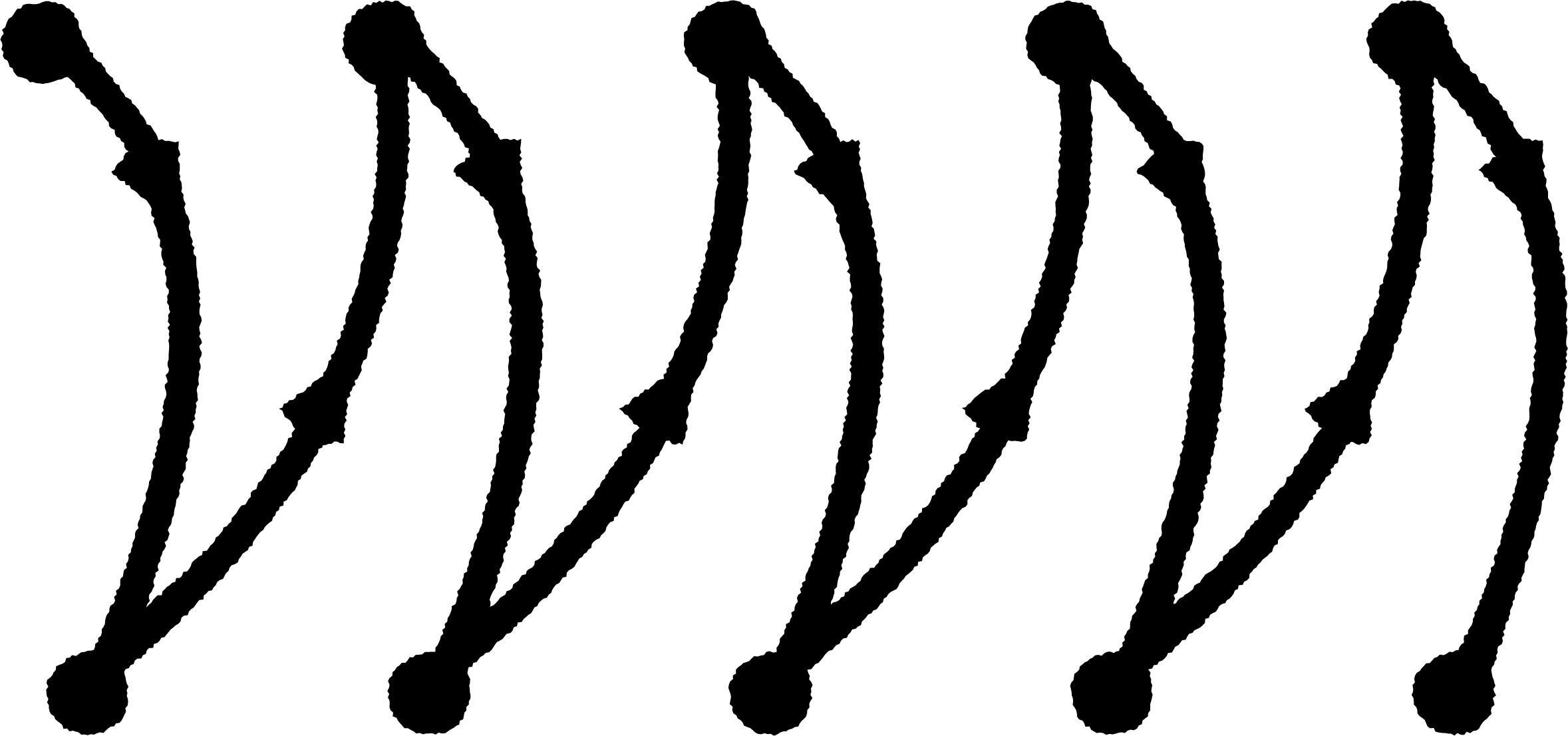
I started looking at welding. A welder joins things. Different materials, different contexts, same skill. I pulled up reference images of weld weave patterns (convex, concave, curlicue, triangle, ladder, lagged ladder) and the lagged ladder pattern stuck. It has rhythm, direction, and hand quality. The dots anchor the arcs like tack points on a bead. Five repetitions, left to right, forward motion.
The mark sits alongside the Third Industries circled-3 as a sibling. Same hand-drawn weight, same black on white, same register. Different identity.
The Type System
The show uses Calder Dark as the display face and Calder Dark Grit for secondary headings. I chose Calder Dark because it has more character than Chainprinter (which runs on petersalvato.com) and the weight felt right against the industrial palette. The Grit variant has a distressed texture that ties into the weld/metal/trades concept.
Calder Dark is now the shared display face across three properties: petersalvato.com, third.industries, and journeymanshow.com. Joinery keeps Archivo because the school has a different register. The shared typography is what makes the constellation read as one maker’s work.
The Palette
I started with warm browns (matching petersalvato.com) and moved to steel, iron, and concrete grays. The show needed its own temperature. Gray felt right: industrial without being cold, neutral enough to let the content carry the color.
The foundation is a warm gray scale from deep iron (#1c1a18) through cream (#eae7e0). Two accent colors pulled from the welding concept: torch blue (#3d8fb5) for annotations and highlights, spark orange (#cb6d2d) for the lower third bar, bullet points, and status labels.
The Show as Product
The show serves three functions at once. It is a distribution channel (the thing that builds an audience when LinkedIn posts and Medium articles returned nothing). It is a networking tool (booking a guest is an invitation, not an ask, and every conversation is a potential consulting relationship). And it is a credibility artifact (the brand walks are applied methodology, publicly, on real brands).
The first guest episodes are with people I already work with: my wife (the Aiden Jae case study, from both sides), a colleague who builds AI automation at my day job (the governance vs. automation tension), and a business consultant whose clients need creative direction I can provide. Each conversation does double work: content for the audience, relationship deepening for the business.
The content calendar has 40+ episodes mapped across the three types, with source material already written. The brand walks draw from six published brand readings on petersalvato.com (Ableton, Milwaukee, Martin, Moog, Dickies, Supreme). The Connections episodes draw from the Engineering Intent essay series (196 published essays exploring cross-domain transfers). The raw material exists. The show compiles it into a different format.
The Format
Research into how successful analytical video channels work changed the approach. The best channels (Every Frame a Painting, Nerdwriter1, Practical Engineering) converge on voiceover with curated visual evidence, minimal face time. The evidence leads, the explanation follows.
Three episode types: Brand Walks (pull up a brand’s web presence and read what is actually there), Conversations (real talk with people who make things), and Connections (two things from different domains, same structure underneath). Solo episodes run 20-30 minutes. Conversations run 40-60 minutes.
Hard cuts only. No fades, no dissolves. Screenshots as evidence on a wallpaper frame, not live screen share. The format matches the register: direct, no performance.
The closest structural sibling is Kirby Ferguson’s Everything is a Remix: one practitioner, a distinctive typographic visual identity, episodic, built around showing structural similarities across domains. The difference is that Ferguson documents the pattern. This show teaches the skill underneath it.
The Graphics Package
Title card, lower third, end card, and wallpaper. All designed as a system: same palette, same type, same mark placement rules. The mark appears on the title card, end card, and lower third. It does not appear on wallpaper or content frames.
The brand guide is a designed HTML deliverable documenting the full system: palette swatches, type specimens, lockup variants, graphics package specs, on-screen rules, and video specs. It is the artifact that governs how every frame looks.
The Production Pipeline
Recording: Fujifilm XT-4 for video, AKG C4000B on an AudioBox 44VSL for audio, DaVinci Resolve for editing. Voiceover recorded first, screenshots laid against it, face shots added for key moments. Bumper animation planned via Blender (the mark drawing on like a weld bead being laid).
Distribution: Transistor for podcast hosting (RSS to Apple, Spotify, Amazon), YouTube for video, clips cut for Instagram and LinkedIn.
Five episode scripts are written. The first episode is a brand walk of Milwaukee Tool.