Altrueism
Transparency as Visual Architecture
The first round of explorations went where most craft brands go: script fonts, cursive motion, gesture. The visual language of handmade warmth. It looked right and matched the category, but it was solving the wrong problem.
The client made handcrafted objects with sustainable ethics. Their world was communal craft, care, rhythm, slow making. The script fonts performed an emotion the client didn’t actually have. The warmth was a category signal. It had nothing to do with how the work actually felt.
A script font tells you “handmade” the same way every other craft brand tells you “handmade.” It’s shorthand, and shorthand was the problem. The brand needed to reflect the actual character of the work, not play a version of it for the audience.
The same thing happened with Aiden Jae. Another craft brand, another case where the generic visual vocabulary would have flattened what made the work specific. The question is always the same: what does the brand need to prove, and is the visual system actually proving it?
The breakthrough: the visual system needed to make the client’s actual working style visible. Through marks, not through messaging. You can see a human hand made this choice. That’s what the brand needed to communicate, and polish would have hidden it.
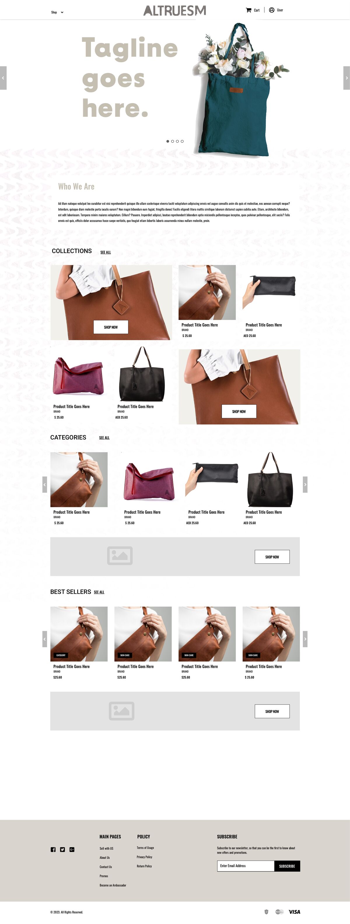
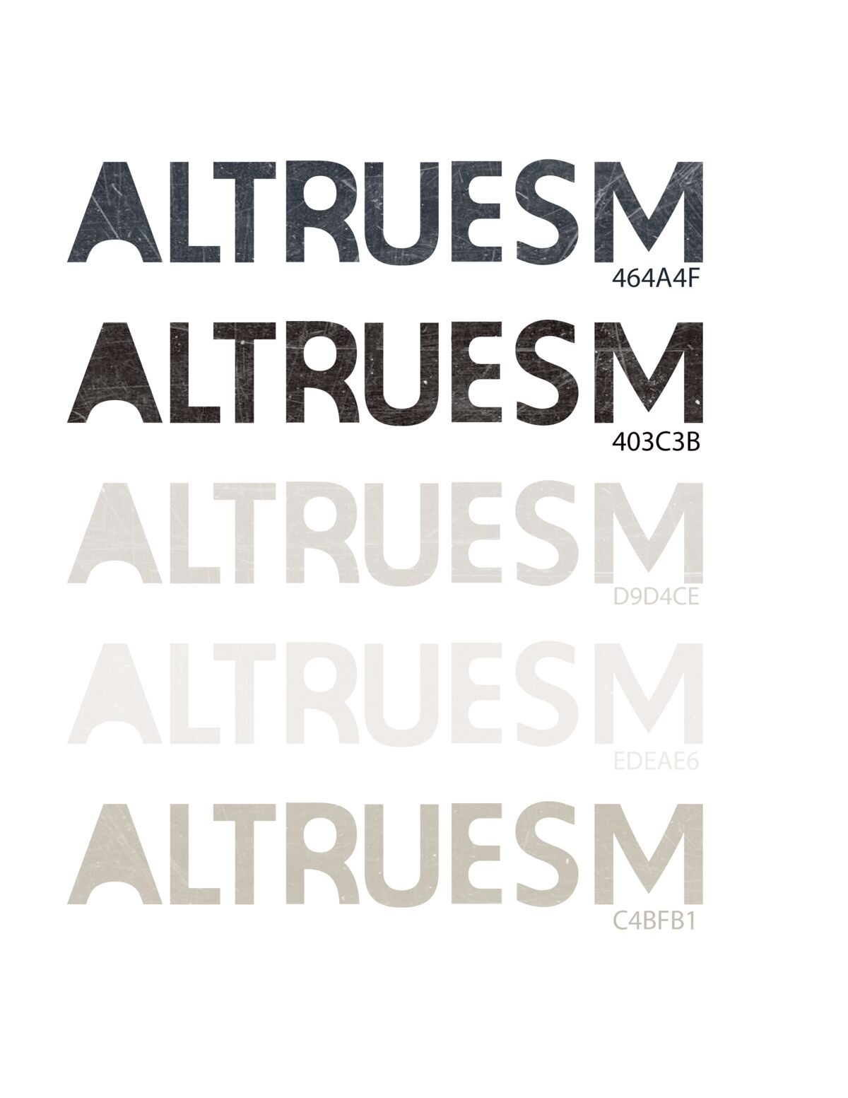
Hand-made mark system. Hand-drawn marks, scanned originals, intentional irregularity, weathered stone textures. The roughness says: we don’t hide behind polish.
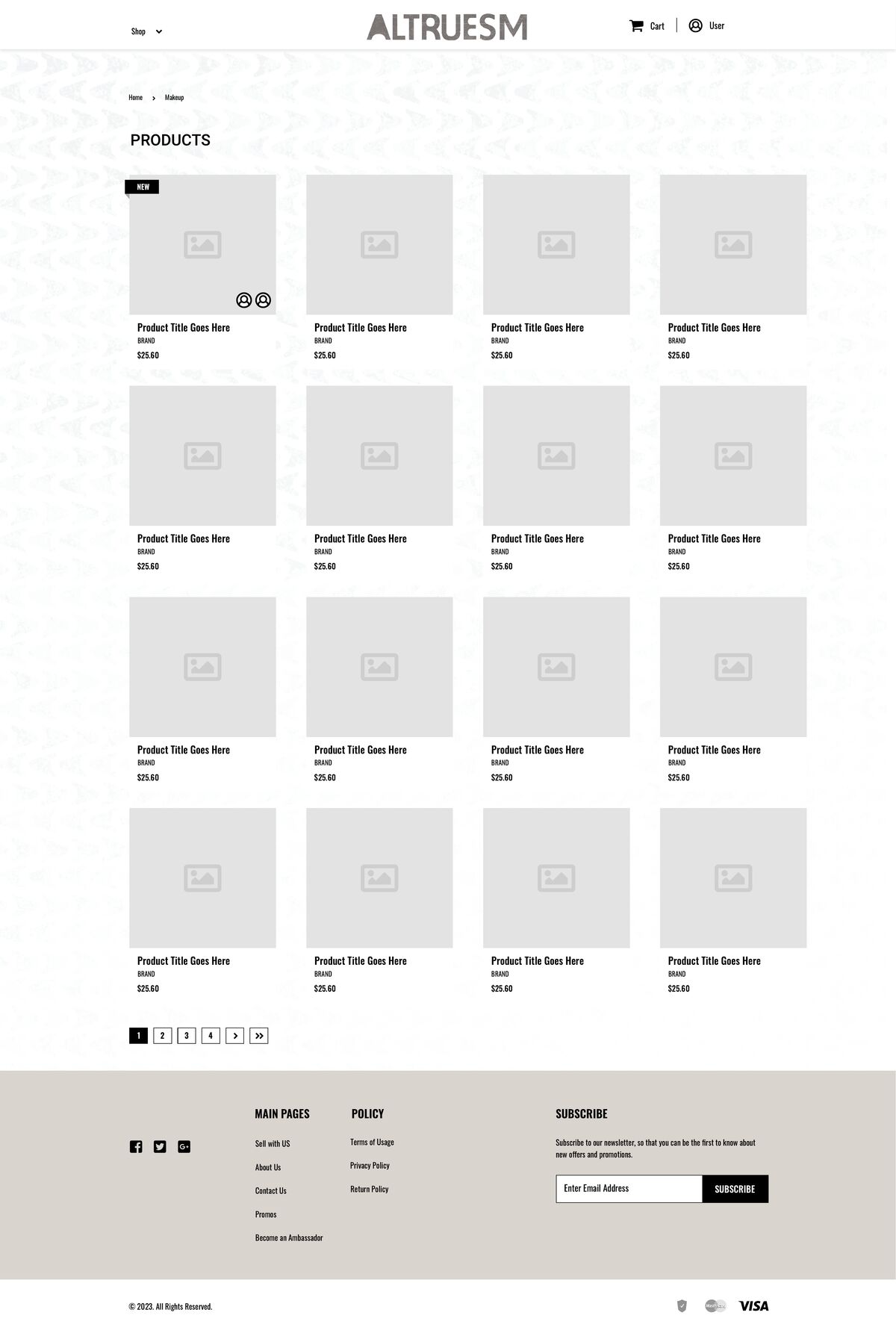
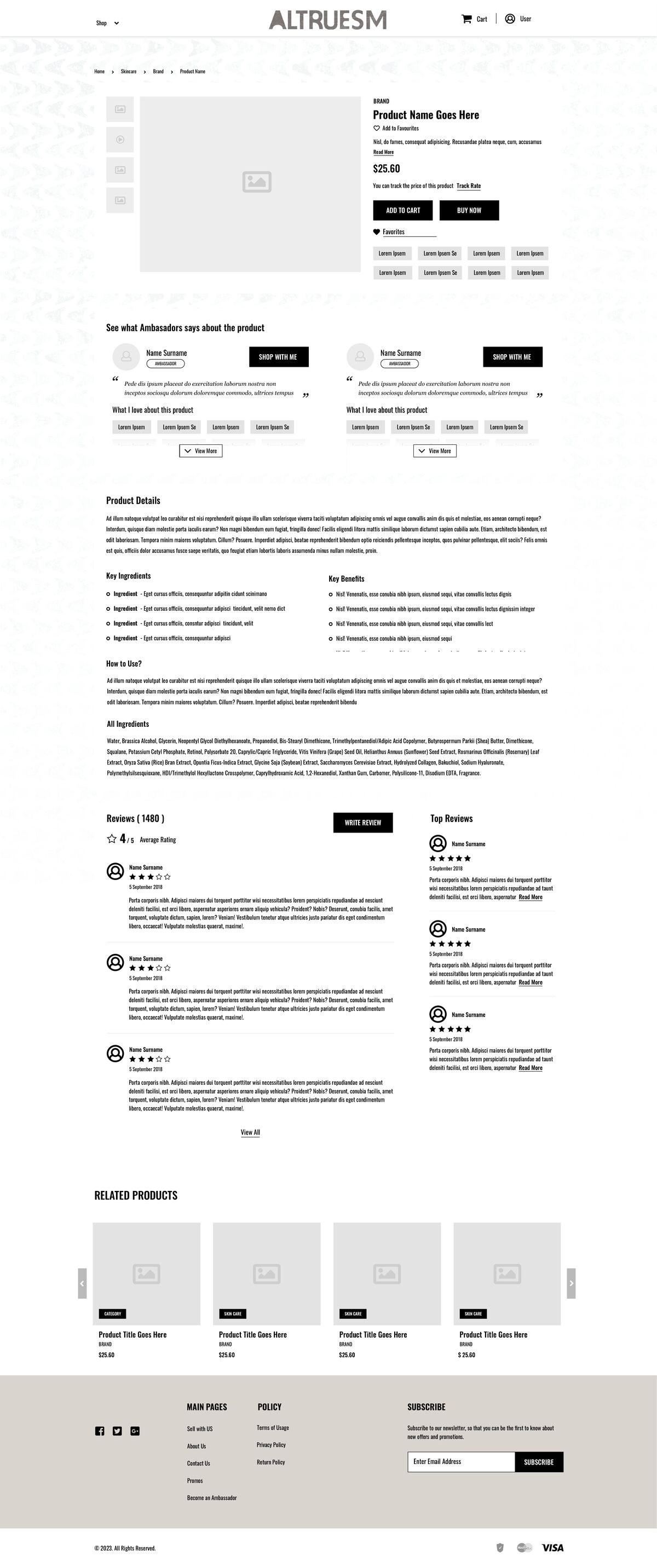
Typography architecture. Rigorous hierarchy, constrained palette, performance-first legibility. Each spacing decision reflects importance.
Color system. Operational. Each color serves a specific function. Limited palette. Accessible by design, because transparency includes access.
Every visual element had to be load-bearing, and if the irregularity was there, it had to earn its place. I think that tension is what gives the system its feel: rigorous structure with rough surfaces.
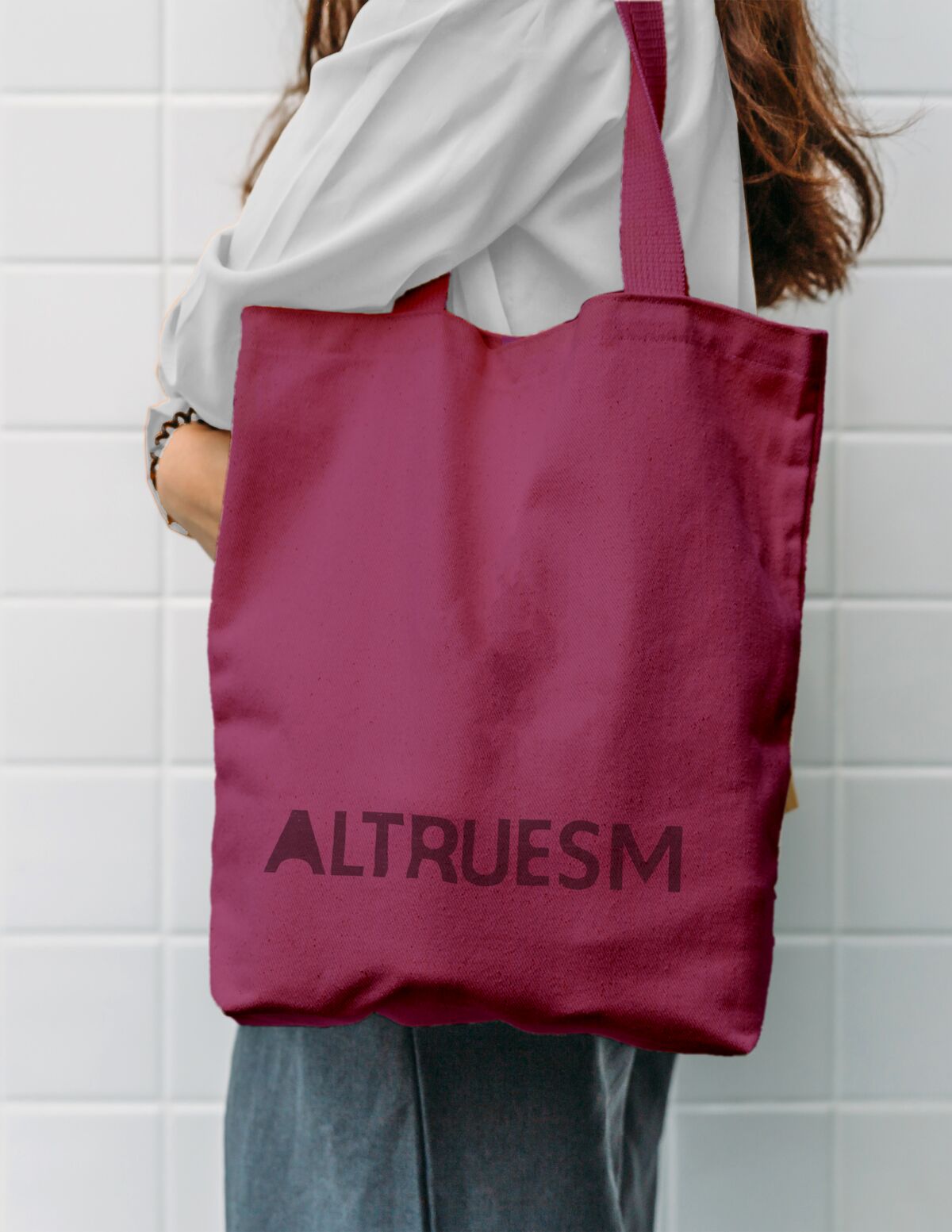
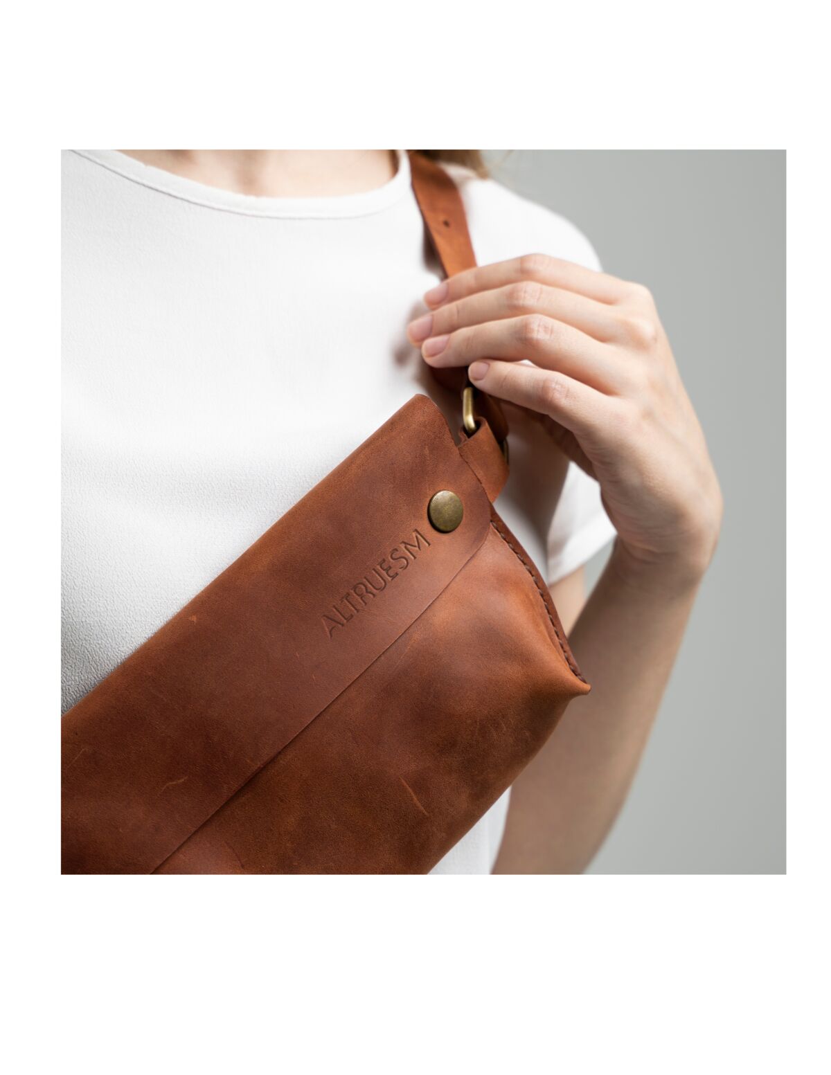
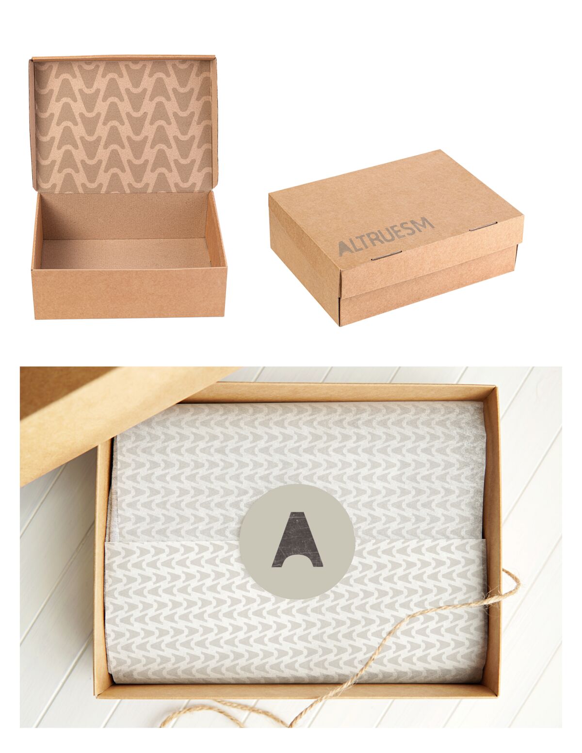
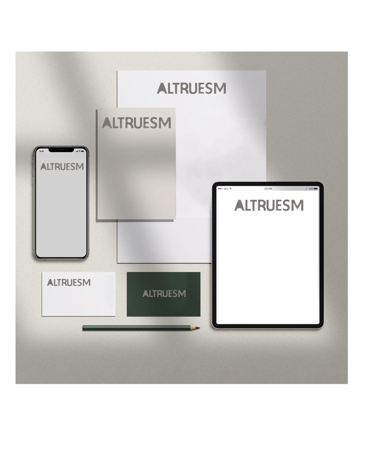
Full identity, visual language, packaging, brand book. Restrained wordmark, earthen palette, humanist typography with intentional breathing room, print materials on recycled stock with visible fiber. The brand book was written so the client could actually make decisions with it. Every element has a reason, and the reason is always functional.
Delivered as one integrated system. I don’t know what they ended up doing with all of it after handoff, but the structure was there if they wanted to use it.