Supreme
The brand that made scarcity the entire identity. The website is the purest expression of that.
Same eight lenses. I came up in the New York Supreme era. Lafayette Street in the late nineties, early 2000s. So I have a specific relationship with this brand that predates the website by years.
Supreme is the opposite of every other brand I’ve read. Every other site has too much content or the wrong content or content in the wrong place. Supreme has almost nothing. And that’s the whole point.
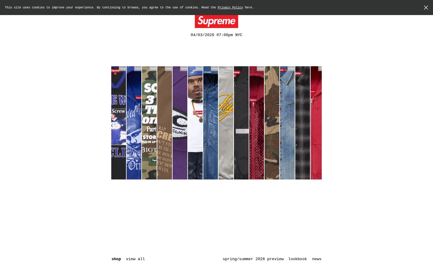
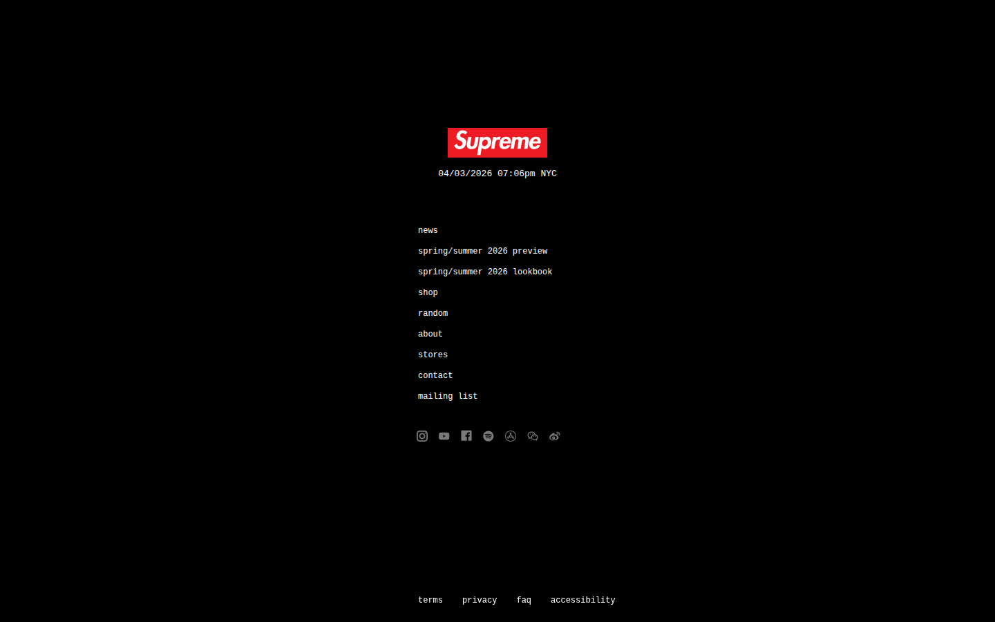
Red box, white Futura Bold Italic. I think this is the most recognized mark in streetwear and it tells you nothing about what the company makes. If you know, you know. That's the whole brand in one design decision.
Red, black, near-white. Three colors and the red only appears on the box logo. Everything else on the entire site is black and gray. I don't think any brand I've read uses color with this level of restraint.
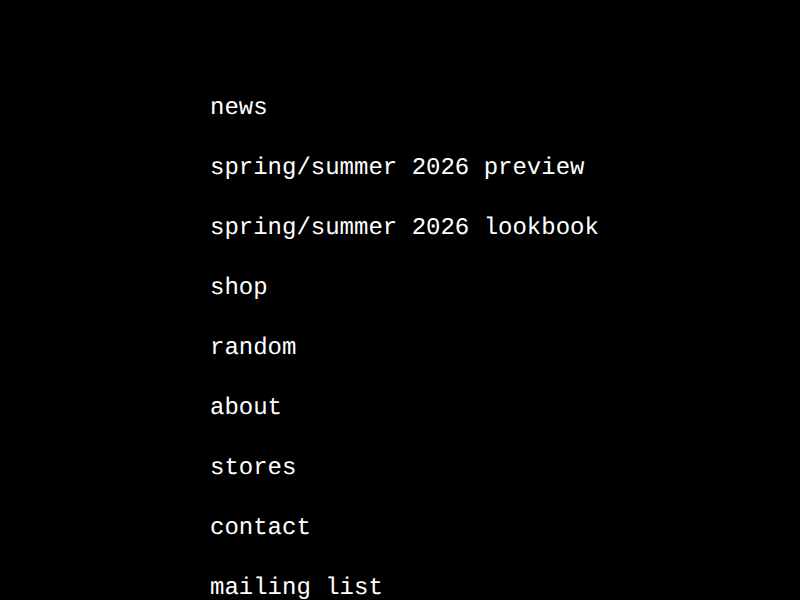
All lowercase. No emphasis on any single link. Every option has equal weight. There's no visual hierarchy telling you where to go first, which I think is deliberate.

Box logo. Timestamp. Nine links. Social icons. That's the entire homepage. No hero image, no product photography, no copy, no call to action. I sat with this page for a while and I think the timestamp is the only thing that confirms the site is even active. Everything else is an absence that assumes you already know what Supreme is.
The shop page shows the current drop when one is active. Between drops, it shows nothing. I think this is the clearest example of scarcity as a structural decision rather than a marketing tactic. The page is empty on purpose and the emptiness is the point.
Photography carries the brand where the homepage refuses to. The lookbook is where Supreme actually shows its aesthetic. But even here, the presentation is minimal. No editorial copy. No lifestyle narrative. Just the clothes on people.
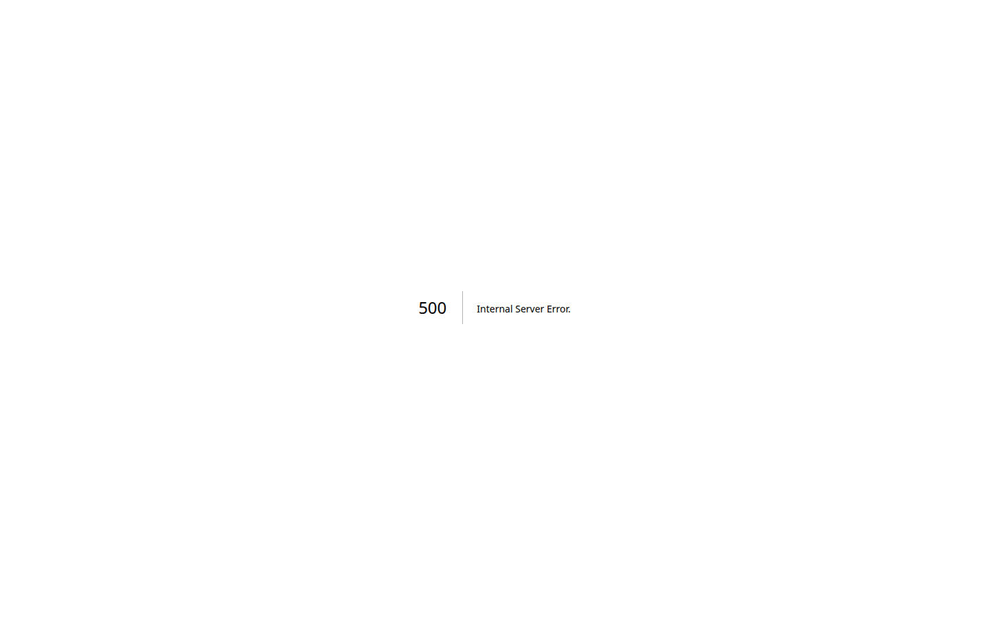
'500 | Internal Server Error.' Raw server error on white. No branding, no navigation, no box logo. The most controlled brand on the internet serves a completely uncontrolled error page. Either they chose not to design one, or nobody thought to. Both say something.
Analysis
I think Supreme’s website is the purest brand voice expression I’ve read, and it achieves that by having almost no content at all. The site commits to scarcity the same way the product does. There’s almost nothing there and the nothing is doing all the work.
I think every other brand I’ve read could learn something from this. Ableton’s about page breaks because it tries to do two things (tell the story and recruit). Milwaukee’s site exhausts because it tries to show everything at once. Martin buries its best content because the commercial pages crowd it out. Supreme has none of these problems because it refuses to have content that doesn’t serve the scarcity.
The question this raises for brand coherence is whether Supreme’s approach is transferable or whether it only works because of the cultural position Supreme built over thirty years. I think it’s the latter. You can’t copy Supreme’s emptiness. The emptiness means something because of the history behind it. A new brand with a blank homepage is just a new brand with nothing to show.
But the principle underneath is real: the strongest structural decision a brand can make is deciding what NOT to include. Supreme decided not to include almost everything. That restraint is what makes the box logo and the timestamp feel like enough. Every brand has that decision available to them. Most are too afraid to make it.
In an era where AI tools make it trivially easy to generate content, I think Supreme’s refusal to have content at all might be the most radical practitioner stance in branding. The human decision on this site was what to leave out, and the answer was almost everything.