Moog
A synthesizer company that built its website the way it builds its instruments. Dark, reverent, and hand-tuned.
Same eight lenses. Moog is interesting because the atmosphere does almost all the work. The palette, the typography, the spacing all say the same thing before you’ve read a word. I think this is the most coherent brand environment I’ve read other than Ableton, and it achieves that coherence in a completely different way.
Lowercase 'moog' in a clean sans-serif. No embellishment. Bob Moog's name set the way you'd write it on a label, not the way you'd put it on a billboard.
Black backgrounds, white type, one golden amber accent that only shows up on hover states and buttons. You don't see the amber until you interact with something. The rest of the site is monochrome.

Extended sans-serif with generous letter-spacing. I think the spacing is doing as much work as the typeface itself. Everything has room around it.
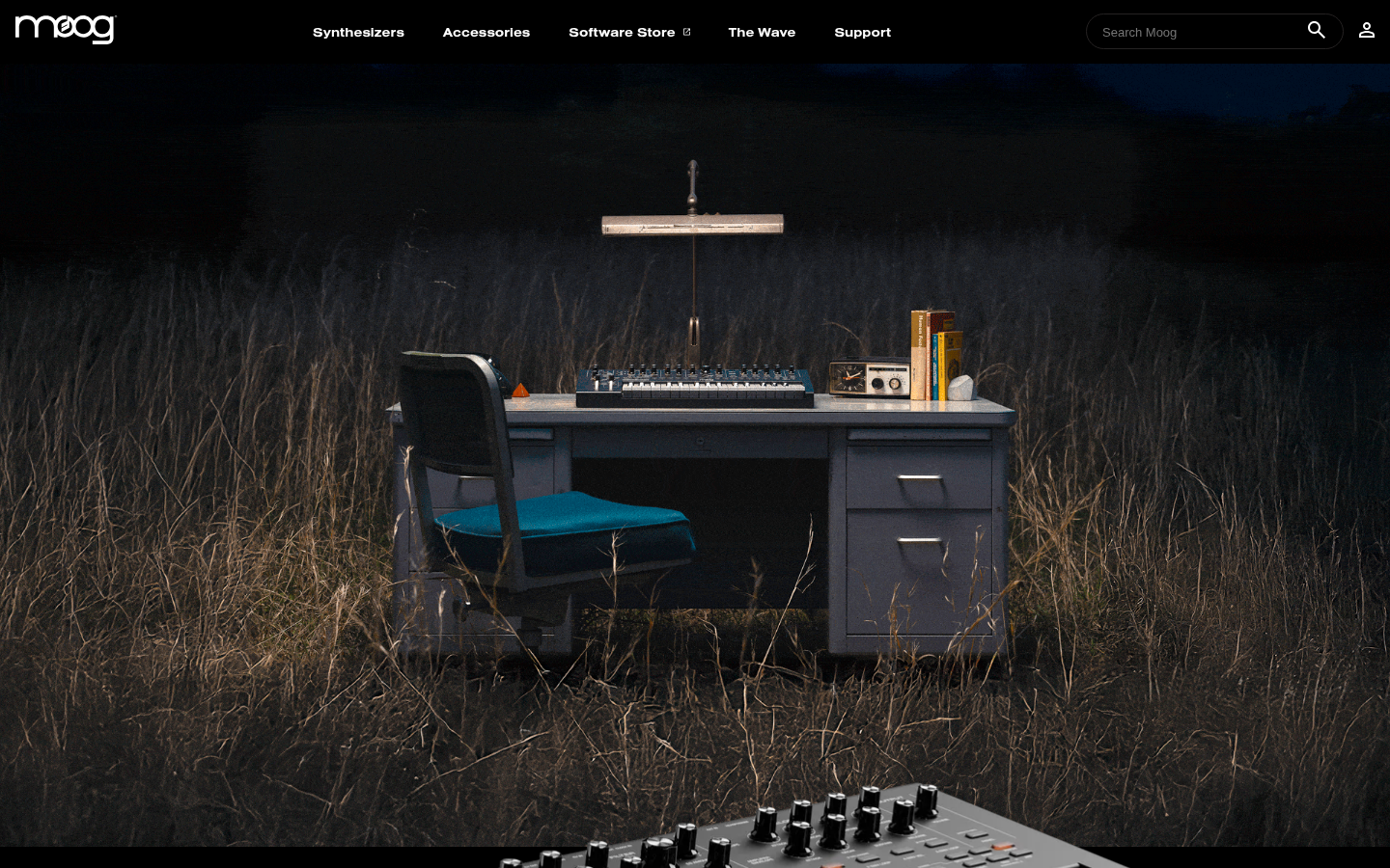
A synthesizer workstation in a dark field. Desk, chair, instruments, books, a lamp. The product is in its habitat, not on a white background. I don't think I've seen a homepage hero that builds a world this completely from a single photograph.
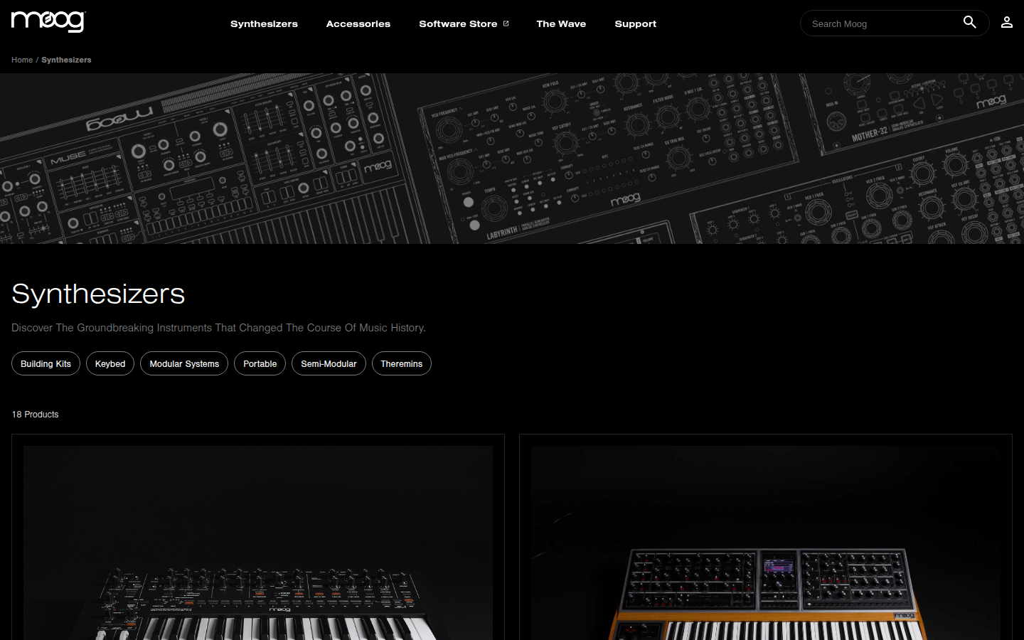
Products on black. Each instrument photographed with the same care. The grid is sparse and I think there's more space between products than most sites give their hero sections. The density is low on purpose.
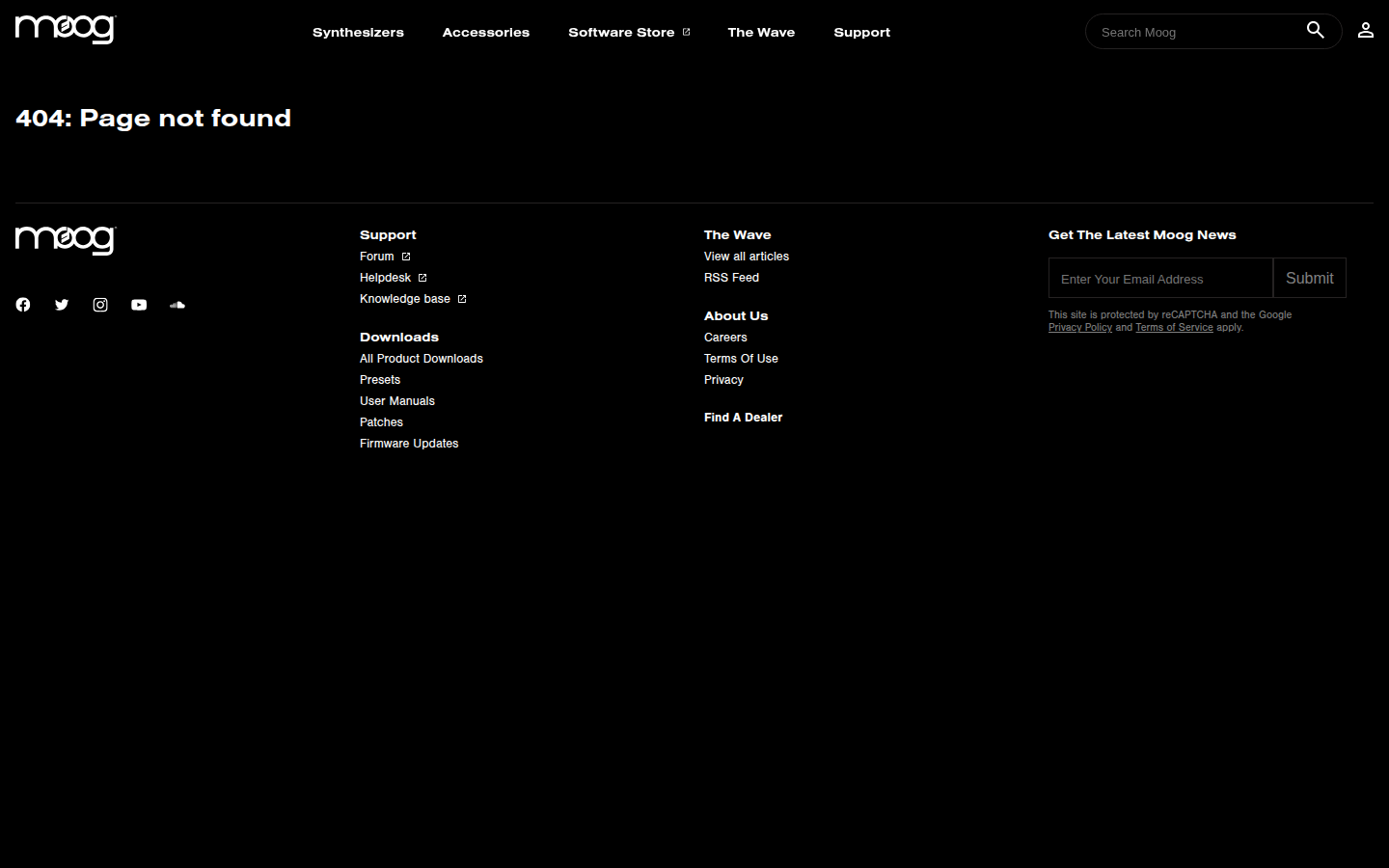
'404: Page not found.' White type on black, then nothing. Most brands panic when you hit a dead end. Moog just holds the room. The 404 is as quiet as the homepage, which tells you the atmosphere isn't a design choice on specific pages. It's the actual temperature of the brand.
Analysis
I think the brand voice on this site is almost entirely in the atmosphere. The copy is minimal. The dark palette, the spacing, the photographic treatment are doing the work that most brands try to do with words.
I think about what this means for coherence at scale. Moog’s site works because it’s small and intentional. Every page feels curated. But that curation depends on someone watching, someone with taste making decisions about what goes where and how much space it gets. If Moog started generating content at volume, the atmospheric coherence would be the first thing to go because it’s the hardest thing to maintain structurally. You can template a product grid. You can’t template the feeling this site has.
The community infrastructure in the footer is worth noting. Forum, helpdesk, knowledge base, downloads, patches, firmware, user manuals. It’s all there, organized and accessible, and it doesn’t compete with the atmosphere. The practitioner relationship is built into the site architecture. Moog assumes you’re going to use the instrument seriously and builds the support for that.
I think the question for Moog is whether this coherence holds as the company grows. Right now it works because every page feels like one person made the decisions. That gets harder.