Milwaukee Tool
Visual discipline with zero narrative. The brand is a wall of red and black confidence with no one behind it.
Same eight lenses, same AI-assisted process. Very different building.
Milwaukee is interesting because the lenses disagreed with each other more than on any other brand I’ve read. The visual coherence scored high across the board. The narrative coherence scored near zero. That disagreement is the finding.
White script on red. Hand-lettered, angled, speed in the letterforms. I think this mark is carrying more of the brand personality than anything else on the site.
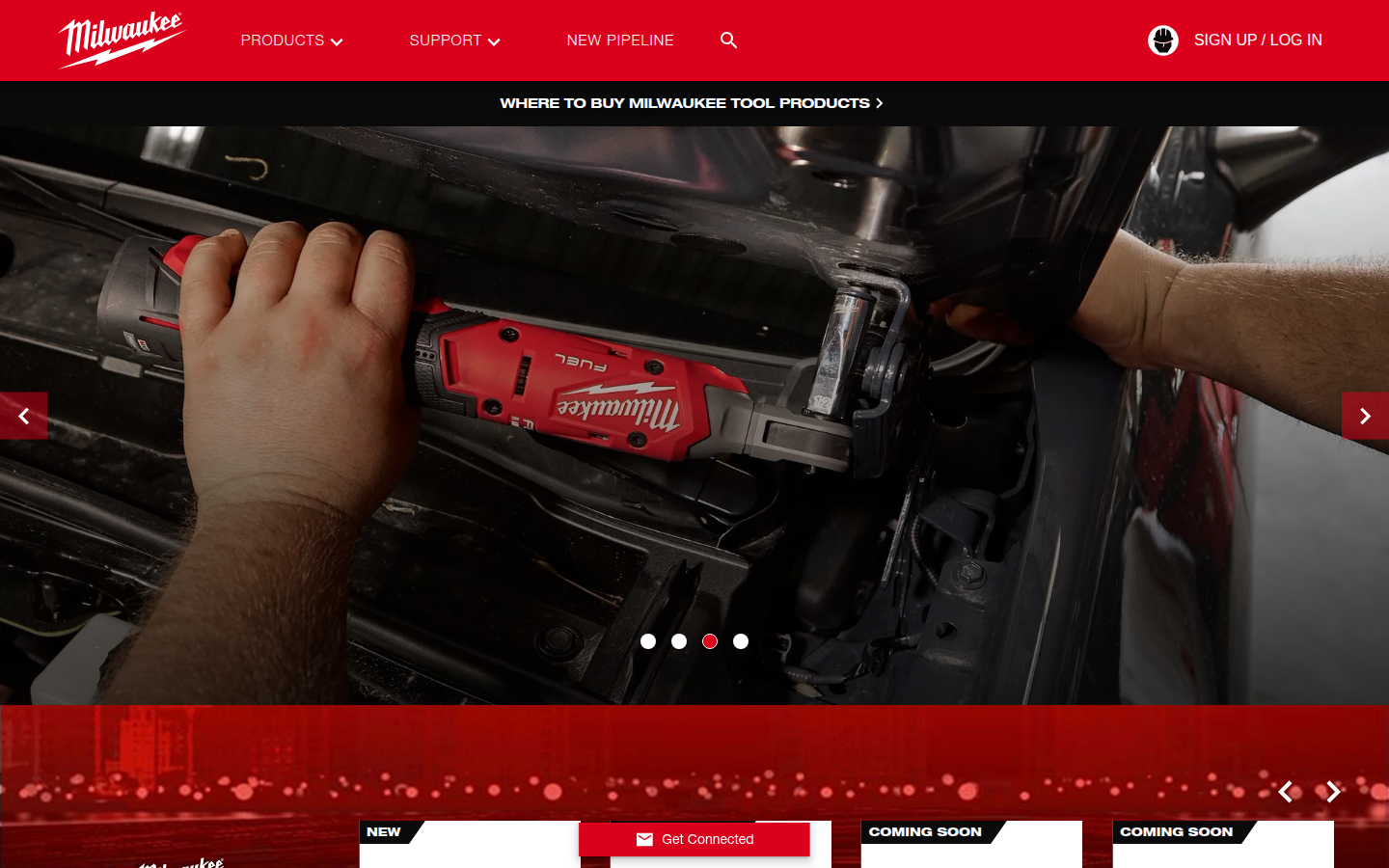
Hero, product carousel, pipeline section, system explorer, category grid, PACKOUT deep dive, ONE-KEY integration. Seven sections before you scroll. I counted. There's no breathing room anywhere on this page.
Red and black. Two colors across the entire site, every product, every page, every system logo. I don't think I've seen a palette this committed to two colors on any brand I've read.
Bold condensed sans-serif, all caps everywhere. M18. MX FUEL. DRIVEN TO OUTPERFORM. One register from the nav to the footer. There's no quiet typographic moment anywhere on this site.
Model number. Price. Photo. That's a product card. If you already know what a hammer drill is and why you'd want the M18 over the M12, this page works. If you don't, there's no way in.
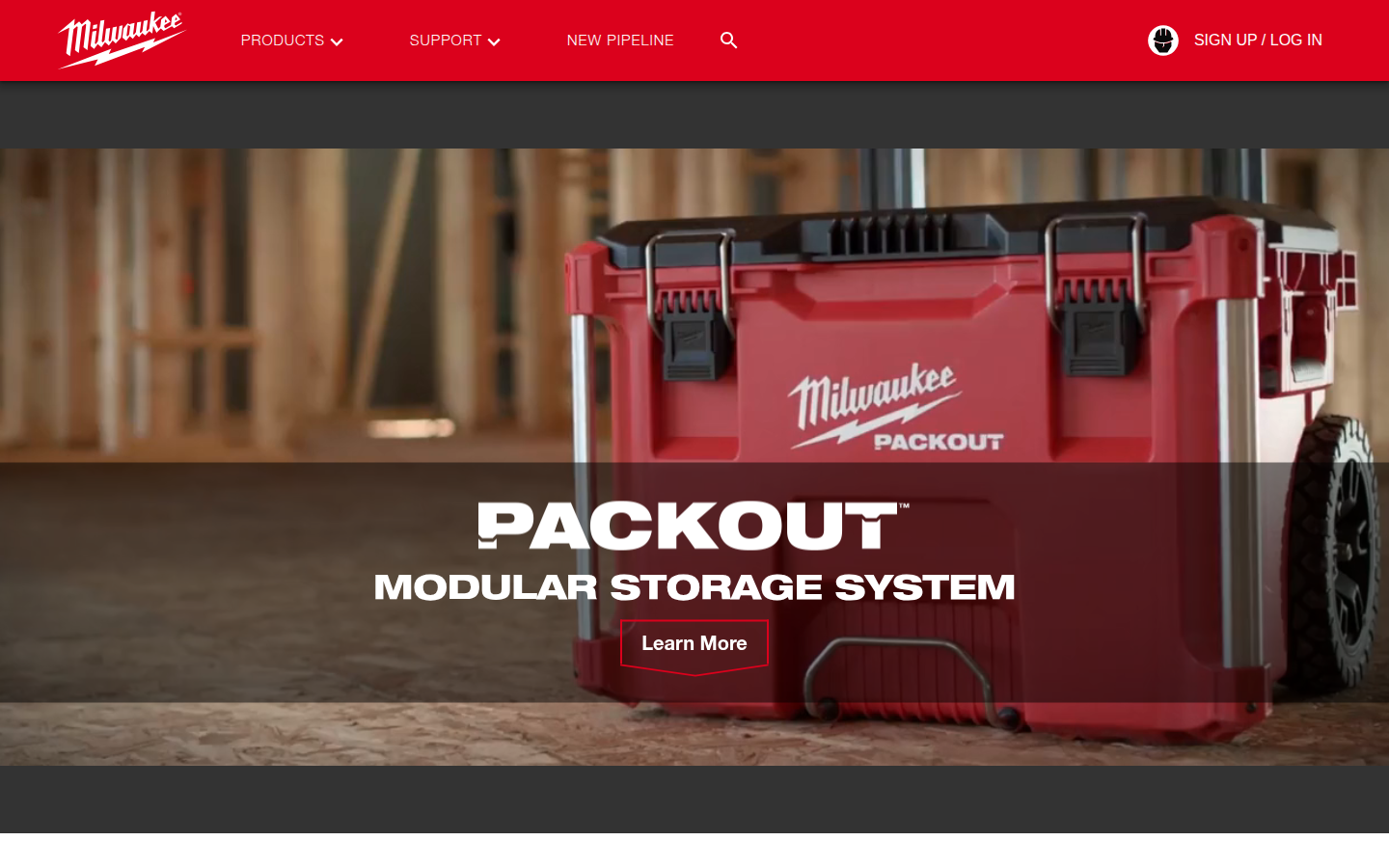
The closest thing to a brand story on the site. Modularity demonstrated through photography: stacked configurations, van installations, populated interiors. Specific friction points being solved. But still a catalog, not a narrative.
404. A company this size, this well-known, this well-regarded by its customers, has no page where it tells you who it is or why it exists.
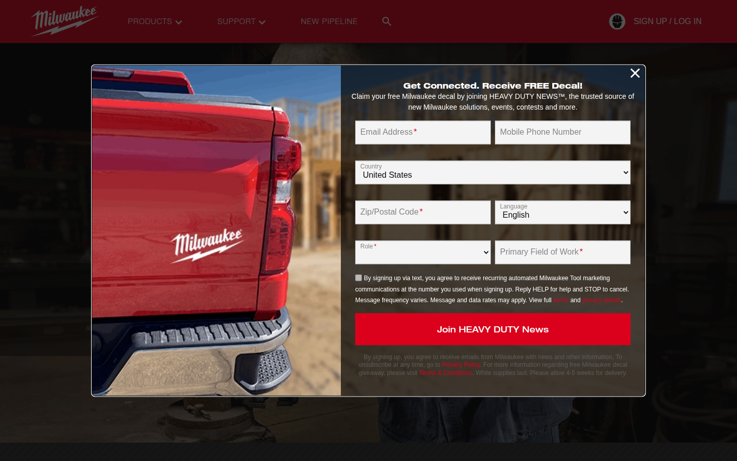
The only community signal on the entire site is a social hashtag in the footer. No blog. No editorial content. No stories about how people use these tools. Milwaukee outsources its brand narrative to user-generated content.
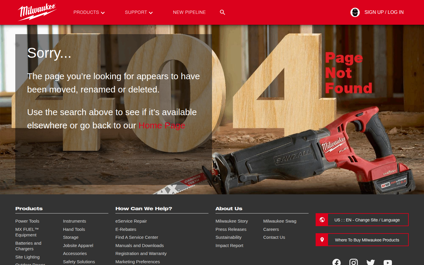
'Sorry...' with a hero image of a SAWZALL and giant wooden 404 numerals. Still selling, even on the error page. Milwaukee can't stop being a showroom for one second.
Analysis
Milwaukee has visual coherence and zero narrative coherence. Everything looks like Milwaukee. Nothing sounds like anyone in particular. The colors hold. The brand voice is absent.
I think about what this means for brand coherence going forward. When you have no narrative foundation, every piece of content you produce is untethered. There’s no voice to drift from because there’s no voice to begin with. If Milwaukee starts generating content with AI tools, and they will because everyone will, there’s no baseline to measure coherence against. The absence of a brand story isn’t just a missing page. It’s a structural vulnerability.
Milwaukee’s customers talk about these tools with pride and identity and loyalty. Tradespeople build their whole setup around the M18 platform and they’ll argue about it the way musicians argue about DAWs. The brand itself talks about the same tools with specs. The customers have the voice. The company doesn’t. And the only reason it works right now is that the customers care enough to tell the story themselves. That’s not a strategy. That’s luck. And luck doesn’t scale.