Krink
A graffiti writer's tool company that became a creative agency. The maker is almost invisible on his own site.
I know Krink from the writing world. Craig Costello started making markers in the nineties for writers who needed something specific that didn’t exist. The K-60, the drip aesthetic, the whole visual language came from one person solving one problem. I wanted to see if the site still carries that signal or if the collaborations have taken over.
Atmosphere and discipline are strong. Authenticity and narrative disagree with each other. That disagreement is the whole reading.
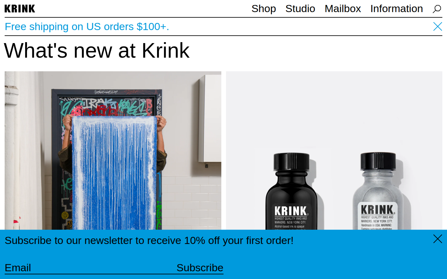
Black and white with rotating accent colors that cycle every five minutes through marker ink tones: magenta, lime green, orange, cyan. The color rotation is clever. It's the only element on the site that references what the products actually do. The rest is a clean Shopify grid.
Four accent colors cycling on a timer. These are ink colors. Marker drips as design system. I think this is the strongest brand decision on the site because it connects the visual identity to the physical product without explaining anything.
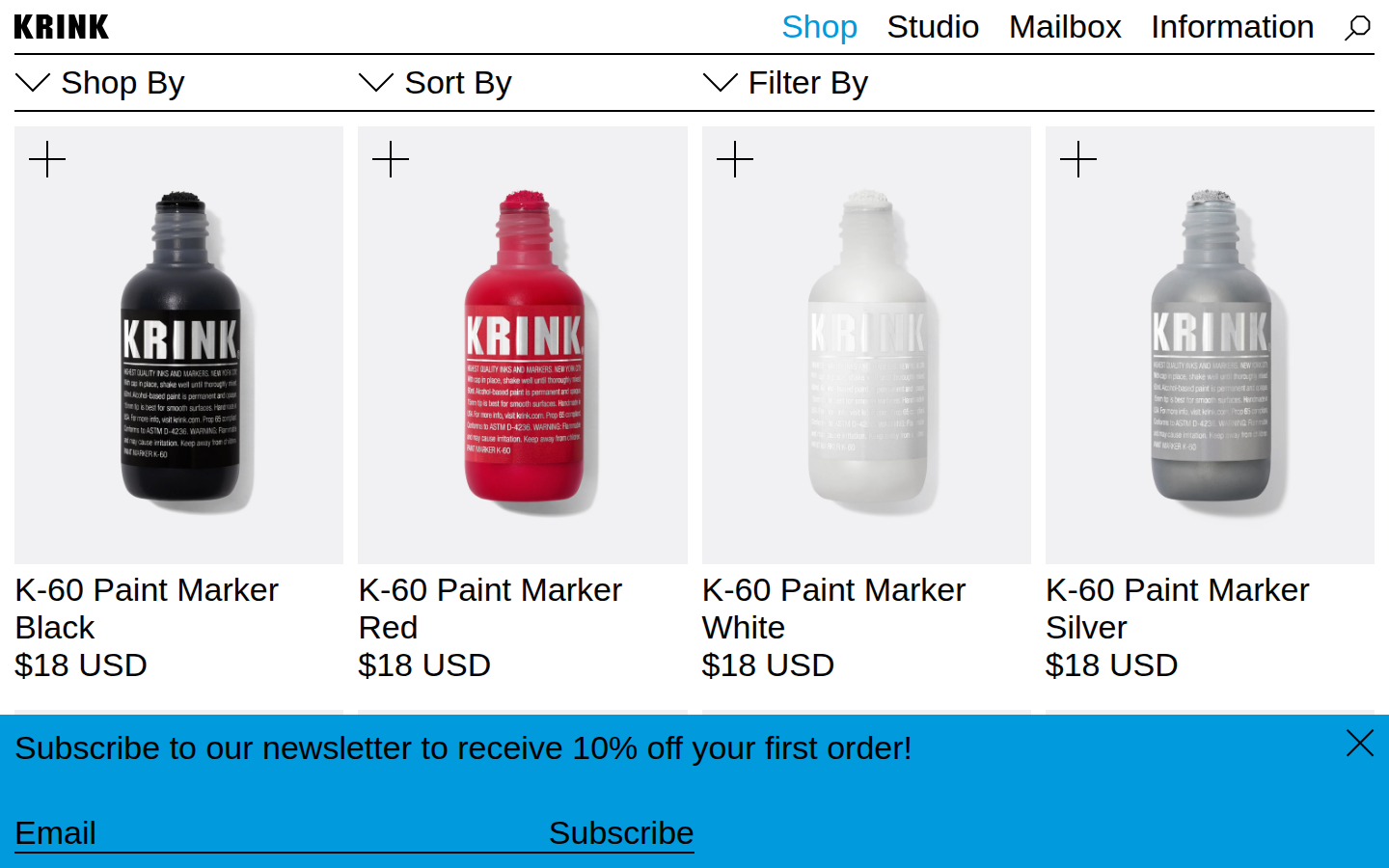
Markers, inks, scribers, sprayers, stickers, apparel, books, editions. Three dollar stickers next to eight hundred dollar art pieces. The range is real but the grid treats everything equally. A K-60 marker (the product that started the brand) gets the same card as a sticker pack.
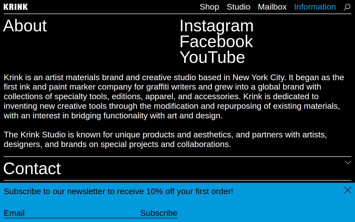
Krink is an artist materials brand and creative studio based in New York City.
Information page
That's the whole description. One sentence. A brand that changed how graffiti writers work, built by one person over thirty years, and the site describes itself the way a LinkedIn profile would.
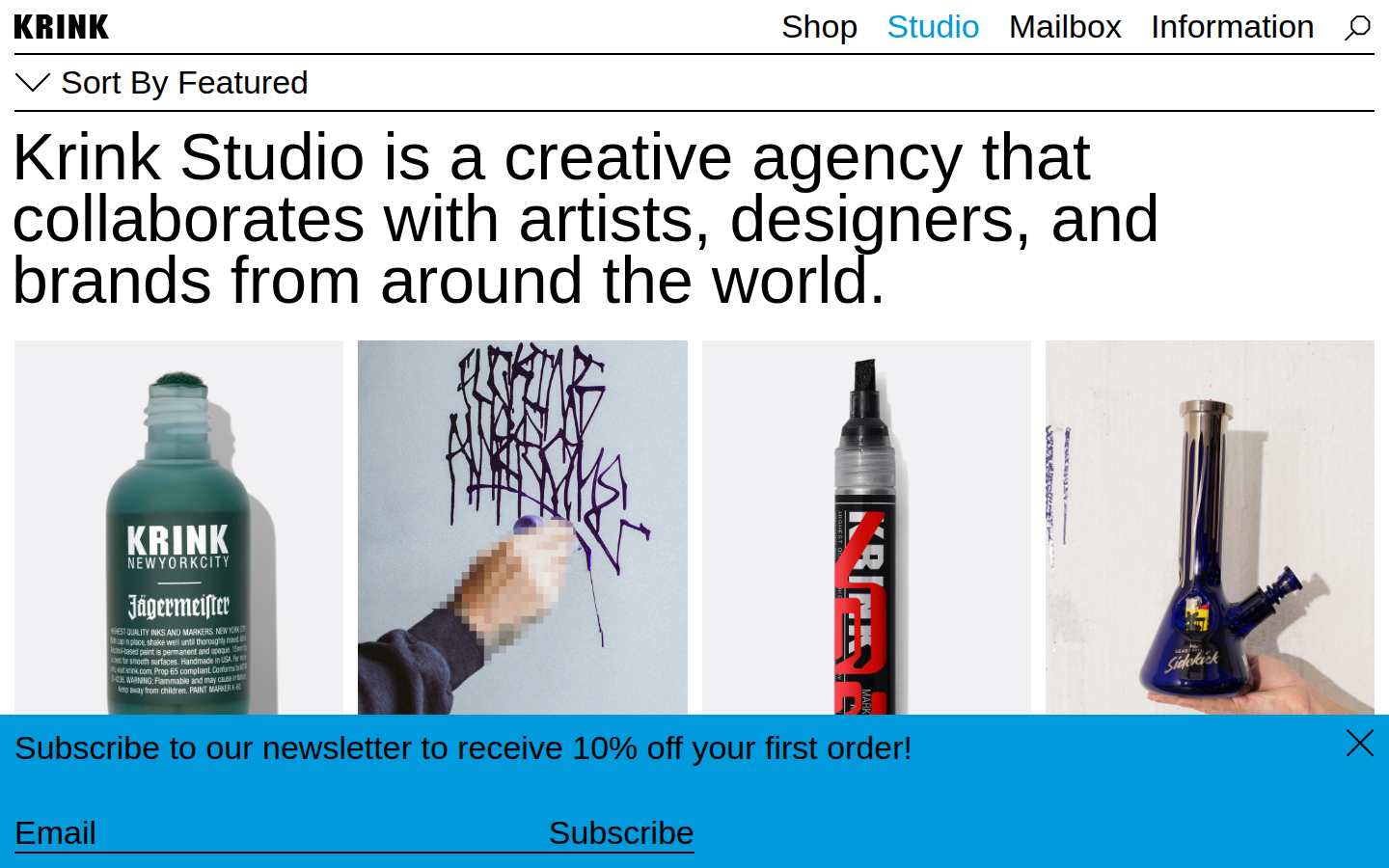
Tommy Hilfiger, Coach, Tiffany, Nike, Drake, KITH, Futura, Felipe Pantone. The collaboration list is long and impressive. Each one gets a thumbnail in an alphabetical grid. The studio page reads like an agency portfolio. It validates through association, not through the maker's own story.
dedicated to inventing new creative tools through the modification and repurposing of existing materials, with an interest in bridging functionality with art and design
Information page
This is buried in the Information page between the shipping policy and the returns policy. The philosophy statement, the thing that explains why Krink exists, is sandwiched between logistics. If this sentence were the opening of the about page, the whole site would read differently.
404. The about page doesn't exist. A brand built by one person with a thirty-year graffiti history has no page where it tells you who that person is or why the brand exists. The Information page covers shipping and returns. The story lives somewhere else.
404. The blog section (called 'Mailbox' in the nav) returns a 404. Whatever editorial content was planned or once existed is gone. The only content on the site is product listings and the studio collaboration grid.
32 33rd Street, Unit #11, Brooklyn, NY 11232. Sunset Park. The physical address is real and specific. I think the fact that Krink is still in Sunset Park, still shipping from Brooklyn, still a studio and not a corporation, is the brand story. And it's on the contact page instead of the homepage.
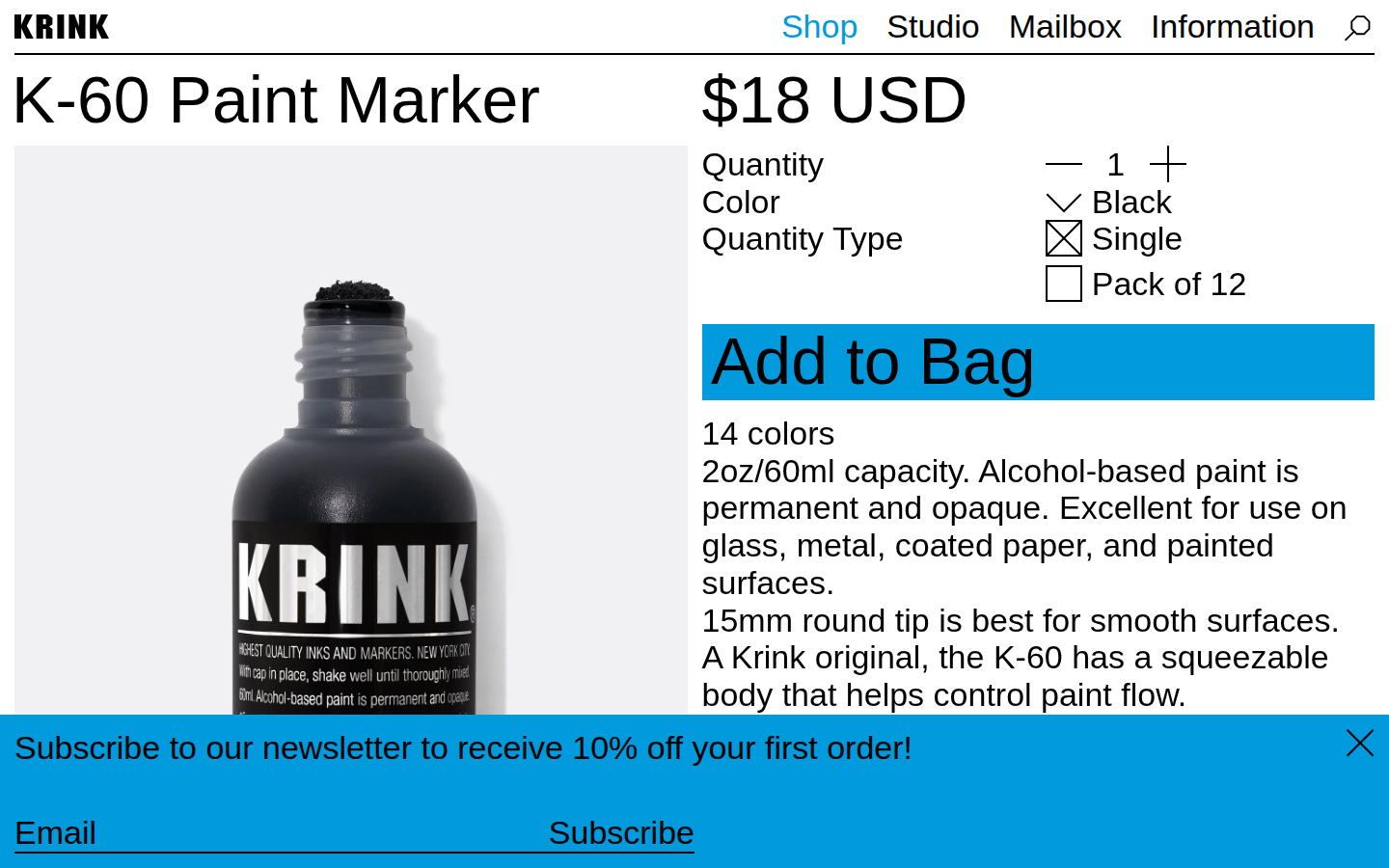
The marker that started everything. A fat-body paint marker with a valve tip that Costello designed because nothing on the market did what he needed. On the site it's a product card with a price. No origin story. No explanation of why this marker exists or what it changed. The culture knows. The site doesn't say.
Analysis
Krink is a Shaw Principle case study. Craig Costello’s markers, his drip aesthetic, his studio in Sunset Park, Brooklyn. The maker and the brand should be one inseparable signal. You should walk onto this site and know who this person is before you’ve read a word. And the atmosphere almost gets there. Black and white, rotating accent colors cycling through marker ink tones (magenta, lime, orange, cyan), clean Shopify grid. The room is right.
But Craig is almost invisible on his own site. The about page 404s. The blog 404s. The Information page compresses the entire origin story into one sentence: a brand that grew from “something underground and not readily accepted.” The Studio page is a collaboration portfolio (Tommy Hilfiger, Coach, Tiffany, Nike, Drake, KITH, Futura) that reads like an agency deck. The collaborations are impressive. They’re also doing the work that the maker’s own story should be doing. The attunement is pointed outward, toward the partnerships, and away from the person who built the thing.
I think about what this means as AI tools make it easier to generate brand content at scale. Krink’s origin story is one sentence. The drip aesthetic that started everything is documented nowhere on the site. If someone generates content for Krink tomorrow, there’s no structural scaffold to hold the voice. The collaboration portfolio provides brand validation through association. The maker’s own methodology, the material invention, the repurposing instinct that produced every product, those are compressed into a contact page in Brooklyn.
The K-60 changed how writers worked. That story lives in the culture, not on the site. The site sells markers and books agency work. Both of those are real. But the fidelity to the origin, the thing that makes Krink different from any other marker company or any other creative studio, is the part that’s missing. Craig Costello’s hands built this brand. The website doesn’t show the hands.