Field Notes
Every piece is attuned. The whole is held together by momentum, not structure.
I’ve bought Field Notes for years. Draplin works at the same intersection I do: design, craft, and personal voice. So this reading matters to me differently. I wanted to see if the site holds the same way the notebooks hold in your hand.
What I found is a brand with extraordinary fidelity at the component level and a site that doesn’t quite scaffold it into a coherent experience. The pieces are beautiful. The whole drifts.
I'm not writing it down to remember it later, I'm writing it down to remember it now.
Homepage tagline
This is the most quoted line in the stationery world and it does something specific. It reframes the notebook from a storage device to a thinking tool. The value is in the act, not the artifact. I think this single sentence carries more brand positioning than the rest of the site combined.
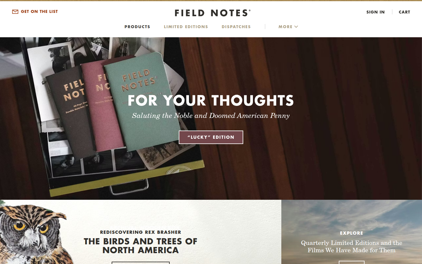
Product grid with seasonal callouts. 'FOR YOUR THOUGHTS' across the top. The homepage is a store, which is fine, but I expected more from a brand that makes films about its printing process. The Original Kraft 3-pack sits in the same grid as the 5E Adventure Set and the Space Pen. Everything at equal weight. No hierarchy tells you what matters most.
Brown, black, warm white. The palette reads as paper and ink before it reads as a website. The kraft brown is the brand. Every other color is just holding space around it.
FIELD NOTES
Futura, exclusivelyThe entire brand uses one typeface family. Every product, every page, every spec sheet. Paul Renner's Futura (1927). I think the commitment to a single typeface across all products and all editions, including ones with wood covers and letterpress printing, is the clearest example of structural discipline on the site. The production experiments are wild. The typography never moves.
Cover: French Dur-O-Tone 80#C 'Packing Brown Wrap.' Body: Finch Paper Opaque Smooth 60#T 'Bright White.' Ink: 'Dachshund Nose' soy-based Toyo. Printer: Service Graphics, Inc., Oakbrook Terrace, Illinois.
Original Kraft product page
This is the brand's real voice. Not the tagline. Not the Dispatches blog. The spec sheet. Naming your ink 'Dachshund Nose' and your press model and your printer's street address communicates a relationship with manufacturing that most brands couldn't fake if they tried. Every notebook page includes this level of detail. It's a production bible disguised as a product listing.
Seventy quarterly editions since 2008. Wood veneer. Photochromic ink. Intentionally misregistered plates. 99,999 algorithmically unique covers. Holographic foil star maps. Each one is a print research project. The archive page presents them as a chronological list. I think this archive deserves the structural attention that the notebooks themselves receive. This is the brand's portfolio and it's displayed as a product catalog.
We asked the printer to knock the printing plates out of alignment, intentionally simulating the registration errors of early four-color offset printing.
'Counting to Fifty' essay, on the America the Beautiful edition
Bryan at Field Notes coined the term 'forensic design' for this practice: dissecting vintage print ephemera and reverse-engineering the production techniques. This is the brand's methodology and it lives in one essay buried in the blog archive from 2021. The methodology deserves a permanent home. It's doing the same work that a practice page does on a portfolio site, but it's filed as a blog post.
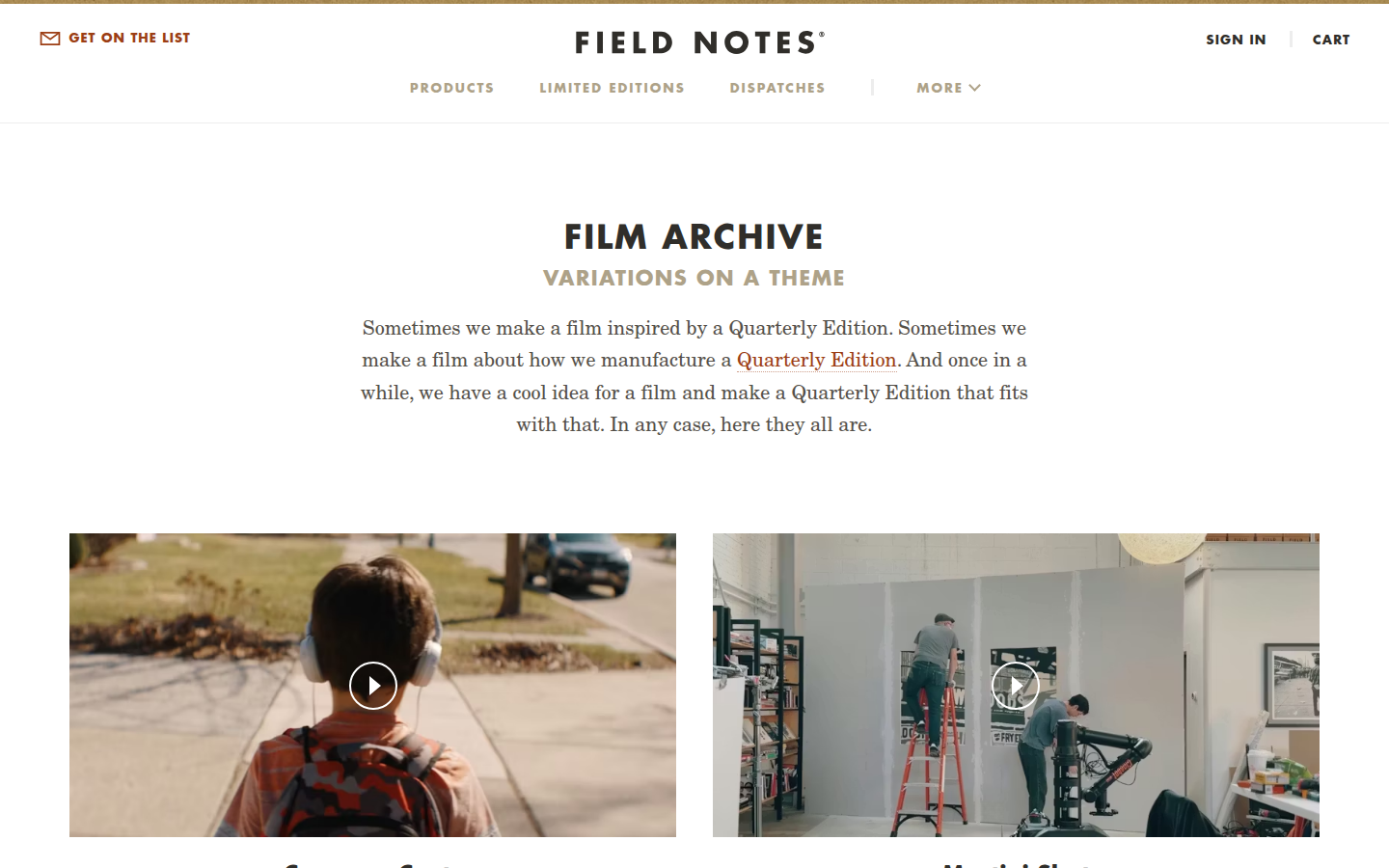
Seventy films. One per edition. Production process, designer interviews, material sourcing. The films page presents them as a list with play buttons and one-line descriptions. Each film is a standalone piece. None of them link to the edition they document. The films and the products exist in parallel but the site doesn't connect them. Someone attuned to the whole would wire these together.
Community photos, event announcements, monthly newsletters, origin essays, Valentine's Day promotions. All in one chronological stream under nineteen different category tags. The best brand writing I've found in any of these readings ('Counting to Fifty') shares a feed with 'Staple Day 30' and spring happy hour announcements. The content is strong. The container doesn't sort it by weight.
I couldn't reach the 404 page, the about page, or the products index. All returned server errors. A brand that names every ink color and every press model and every corner radius serves a raw error when you hit a dead link. The notebooks are finished to a 3/8-inch radius. The site has gaps that the production team would never accept on a print run. That's the finding: the attunement is real but it stops at the edge of the physical product.
Analysis
Field Notes has the deepest material voice of any brand I’ve read. The Original Kraft product page names the paper stock (French Dur-O-Tone 80#C “Packing Brown Wrap”), the ink (soy-based Toyo “Dachshund Nose” black), the press (Mitsubishi Diamond Series 40” 6-color), the printer (Service Graphics, Inc., Oakbrook Terrace, Illinois), the corner radius (3/8”, 9.5mm), the stitcher (Heidelberg ST350). This is not marketing copy. This is a spec sheet written by someone who stood next to the press and watched the sheets come off. That level of material attention is the brand’s actual identity. It communicates more about who Field Notes is than any tagline could.
The limited editions are where the attunement gets interesting. Seventy quarterly editions, each one a production experiment. Wood veneer covers. Photochromic silkscreen ink. Intentionally misregistered printing plates to simulate vintage four-color offset. 99,999 algorithmically unique covers. Cherry wood, letterpress, holographic foil. Each edition is a research project that becomes a product. The “Counting to Fifty” essay calls this approach “forensic design”: dissecting vintage print ephemera and investigating historical production techniques. That phrase describes the entire brand posture. Field Notes treats printing the way a luthier treats wood.
The structural question is whether the site scaffolds that fidelity into a coherent experience. I think it doesn’t, quite. The homepage is a product grid with seasonal promotions. The Dispatches blog mixes community photos, event announcements, monthly newsletters, and deep production essays in a single chronological stream. The films (seventy of them, one per edition) live on a separate page with no connection to the products they document. The “Counting to Fifty” essay, which is the best piece of brand writing I’ve encountered in these readings, is buried three years deep in the blog feed. The material craft is attuned at every joint. The information architecture is not.
I think what holds Field Notes together is momentum, not structure. The quarterly cadence (four editions a year, subscriber boxes, launch events, films) creates a rhythm that carries the brand forward. Subscribers are the scaffold. The site is just the storefront. That works as long as the cadence holds and the community stays engaged. But it means the site itself doesn’t do what the notebooks do. The notebooks are structurally precise down to the corner radius. The site is a competent Shopify store that happens to contain extraordinary content. Someone is attuned to every notebook. I don’t think anyone is reading the site as a system the way the production team reads each print run.