Dickies
Workwear that became culture. The brand barely tries, and that's the whole identity.
Same eight lenses. I wear Dickies, so this one is personal in a different way than Martin. I wear them because they’re cheap, durable, and they don’t try to be anything. That last part is the interesting thing about the brand, and I wanted to see if the website holds that.
The horseshoe wordmark. Red, simple, industrial. Most people see this mark for the first time on a uniform pocket or on the back of a pair of 874s, not on a website.
Warm orange, black, off-white. Earthy and grounded. It reads as workwear without leaning on the heritage angle, which I think is the right call for this brand.

IBM Plex Sans. Clean, professional, slightly industrial. I think it's the right typeface for a brand that gets its personality from somewhere other than the design.
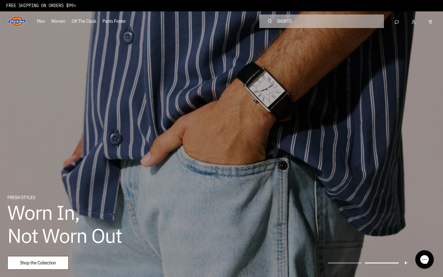
'Worn In, Not Worn Out.' Lifestyle photography, a hand in a pocket, a striped shirt. The hero image says casual style, not job site. Dickies is reaching for the fashion audience without letting go of the workwear roots.

Clean product grid, consistent photography, price points visible. Competent e-commerce. I looked at this page for a while trying to find something to say about it and I think the fact that there's nothing to say is the observation.
'Since 1922' anchors the credibility. The about page exists, which puts Dickies ahead of Milwaukee. But the heritage is presented as a fact, not as a story. A hundred years of workwear and the narrative is a timeline, not a workshop.

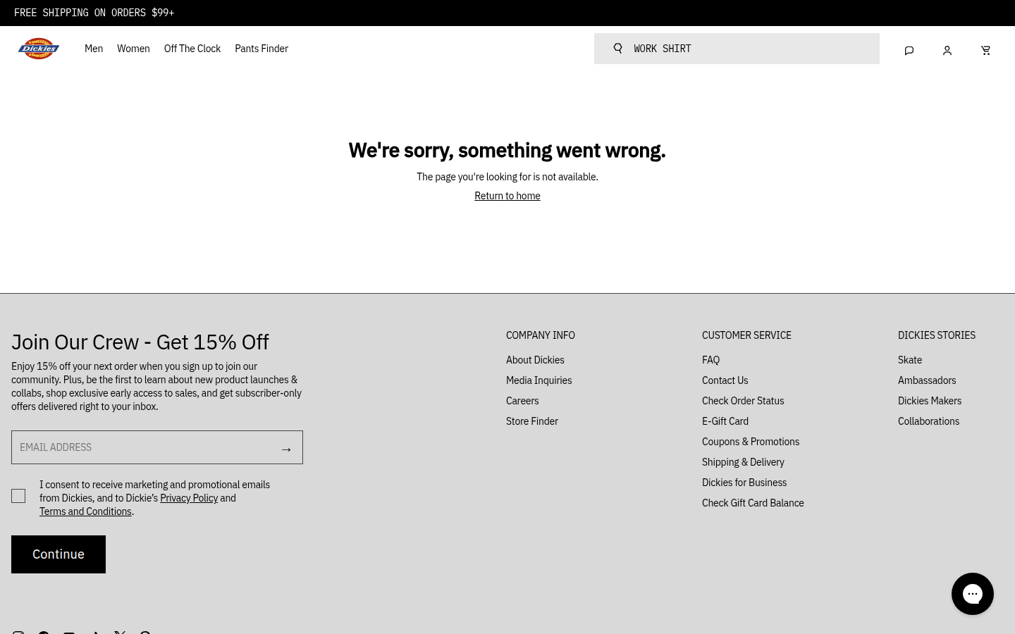
'We're sorry, something went wrong.' Then straight into the newsletter signup. I think this is actually the most honest page on the site. The 404 sounds exactly like every other page: polite, functional, forgettable. Dickies built a century of cultural identity and the website treats all of it, including the error page, with the same careful nothing.
Analysis
Dickies has a problem that most brands would love to have. The brand identity is so embedded in culture that the website almost doesn’t matter. Skaters, artists, mechanics, construction workers, nurses. People wear Dickies because Dickies are Dickies. The brand barely has to speak because the audience already knows.
But that cultural identity doesn’t live on the website. The site is a clean, competent e-commerce store. “Worn In, Not Worn Out” is a good line. IBM Plex Sans is a solid type choice. The orange accent is warm without being aggressive. None of it is wrong. And none of it captures what Dickies actually means to the people who wear them.
The brand voice exists in the culture, not on the site. When someone puts on Dickies 874s, they’re making a statement about not making a statement. That anti-fashion stance is the identity. The website doesn’t know how to present that. It presents workwear as product, not as posture.
I think this is a coherence question. The brand has two voices: the cultural voice (worn by skaters and punks and tradespeople who chose function over fashion) and the commercial voice (durable workwear since 1922, shop the collection). Those two voices don’t connect on the site. As AI tools make it easier to generate product content, the commercial voice will get louder because it’s easier to automate. The cultural voice requires someone who understands that the brand’s power is in what it doesn’t say.
Dickies doesn’t need to say more. It needs to structurally protect the silence that makes it cool.