Bob's Red Mill
Turner Duckworth redesigned 200 products for a brand that already had the thing most rebrands are trying to fake. I buy their flour. I wanted to see what they kept and what they gave up.
I buy a lot of Bob’s Red Mill. I’m celiac and I bake, so I know these bags by feel. I can spot the Gluten Free seal from across the aisle without reading it. When your health depends on recognizing a package, you develop a specific relationship with the brands you can eat.
Bob’s just redesigned everything. Turner Duckworth, 200 products, custom typeface, color-coded categories. Rolling out September 2026. This is a brand that already had the thing most rebrands are trying to manufacture: a founder who rebuilt after an arson, employee ownership, 50 years of milling. The old packaging looked like someone in the back office put it together, and that honesty was why it worked. The redesign is strong. There’s a real tension underneath it.
The new script keeps the upward slant and the hand-lettered energy. Cleaner, more confident letterforms. Turner Duckworth describes it as 'fresh yet handcrafted.' The old logo was rough because it was rough. This one is rough because a skilled type designer drew it that way. Both work. They work for different reasons.
Dark brown top bar, red wordmark, warm cream body. The blue only appears on story pages, which gives the brand narrative a different temperature than the product pages. Kitchen warmth on the commerce side, something quieter and more archival on the history side. I like the separation.
'Red Mill,' a custom typeface inspired by hand-painted farmstead signage and old shop windows. I think this is the strongest move in the rebrand. The reference comes from the brand's actual material history, not a mood board. A lot of rebrands reach for type that feels premium. This one reached for type that feels like the building where the flour is milled.
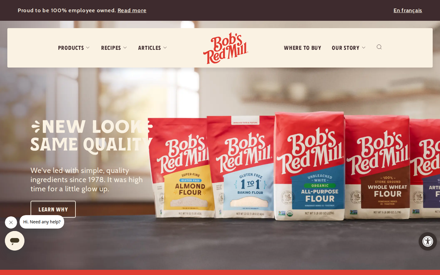
'New Look Same Quality' with the new packaging lineup. The hero addresses the rebrand directly, which tells you the company knows their customers notice. Newsletter popup appears on every page before you scroll, covering a third of the viewport. That's an aggressive interruption for a brand trying to build warmth.
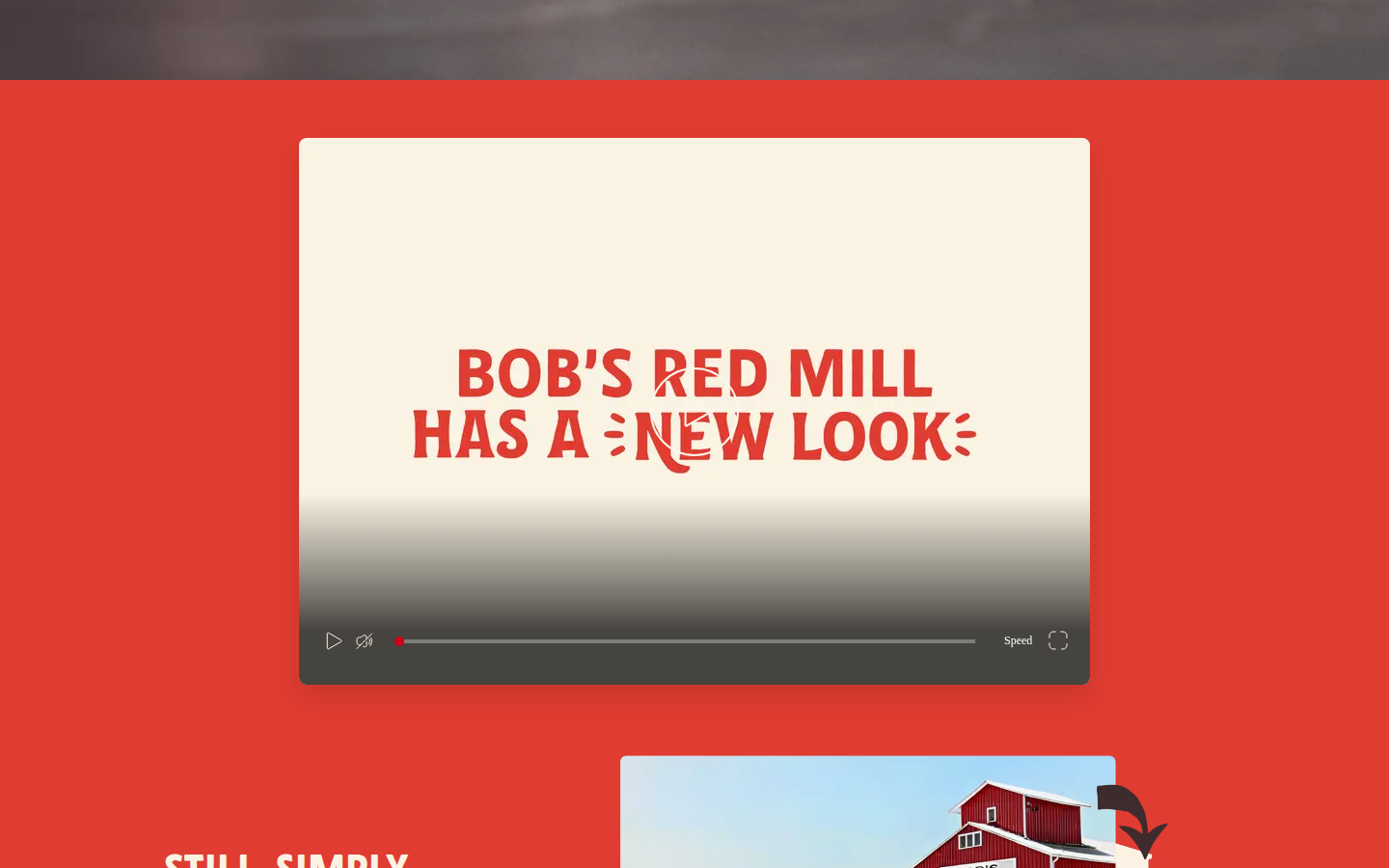
A dedicated page with a video explaining the redesign. Most brands swap the packaging quietly. Bob's made a page about it, with the custom typeface front and center and the mill illustration visible below. Confidence in the work, and respect for customers who will notice the change.
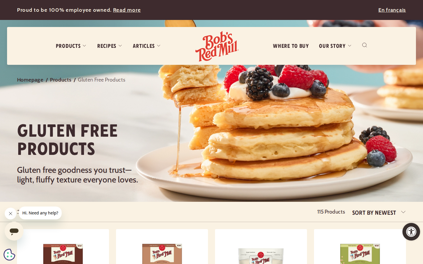
115 gluten-free products. Lifestyle hero (pancakes, berries) instead of a product shot. The color-coded category system is the functional heart of the rebrand: faster scanning, clearer grouping. The old site required reading text to differentiate products. If the color system works at shelf distance the way it works on screen, this is the part of the rebrand that matters most to someone shopping with dietary restrictions.
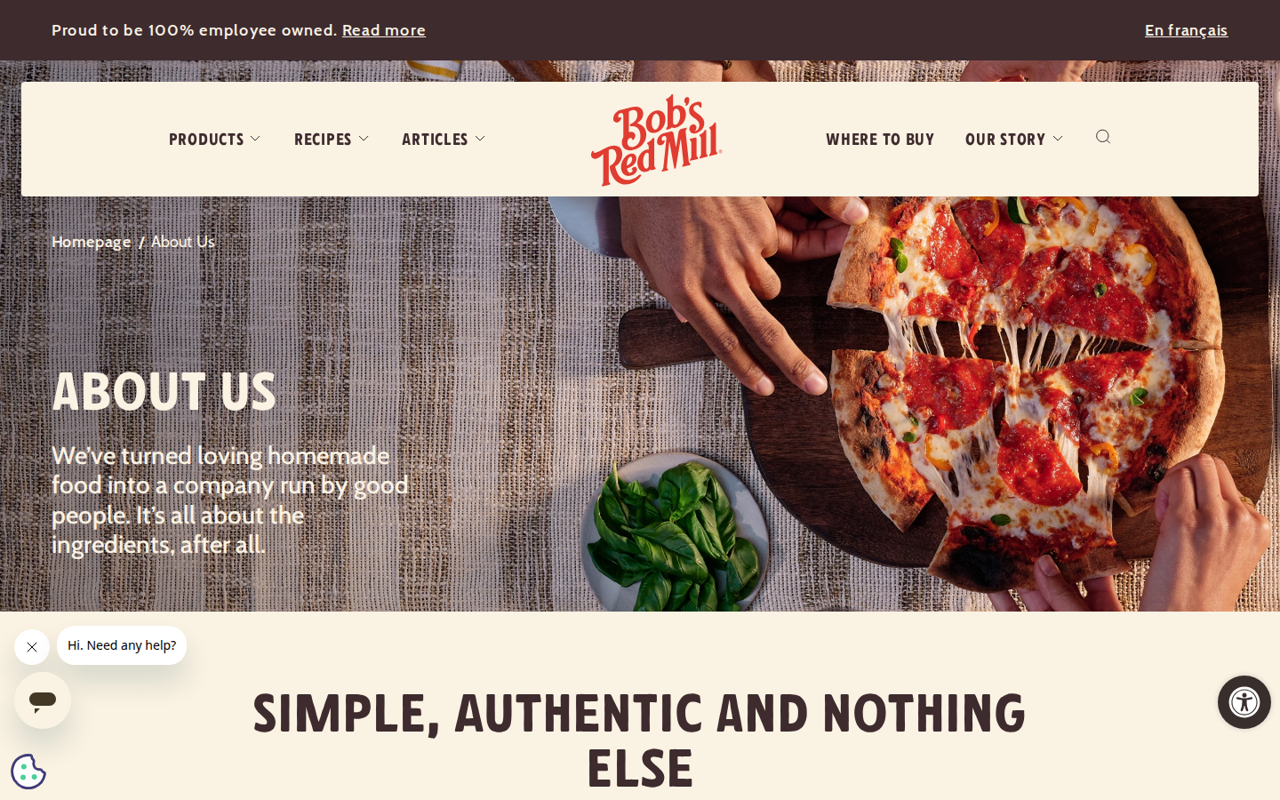
'SIMPLE, AUTHENTIC AND NOTHING ELSE.' The about page carries the old framing: Bob and Charlee's story, employee ownership, the values. Wood-grain texture and pizza photo are warmer than the previous version, but the copy reads like it was written in a different era than the rest of the redesigned site. It probably was.
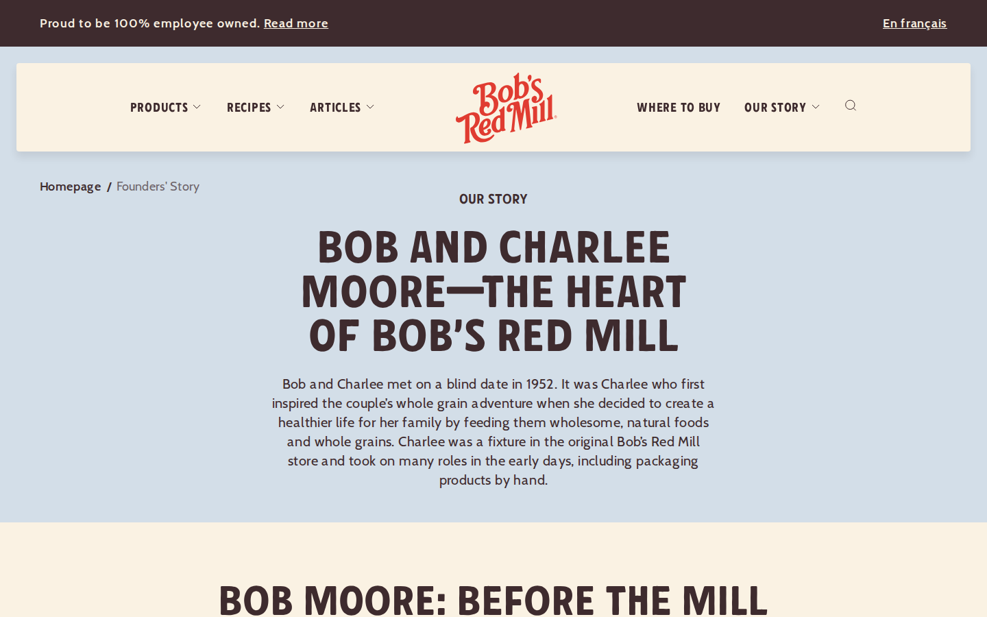
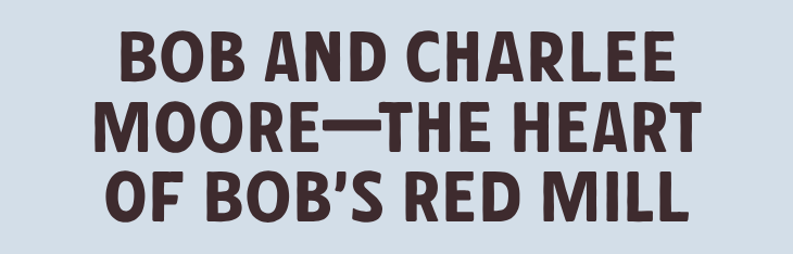
Bob and Charlee Moore, blind date in 1952. The Red Mill typeface at its biggest. Blue background gives this page a different temperature than the cream-and-brown product pages. Bob Moore died in 2023 at 94. He founded the company after his first mill burned down in an arson, rebuilt it, made it employee-owned. The face on the old packaging was the person who made the thing. Now it's a seal.
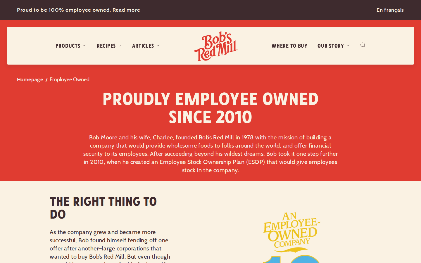
'PROUDLY EMPLOYEE OWNED SINCE 2010.' Bob created the ESOP rather than sell to a corporation. That fact sits in the banner on every page of the site. Employee ownership is a structural claim that can't be faked, and its persistence across every page carries more brand weight than any individual design decision on the site.
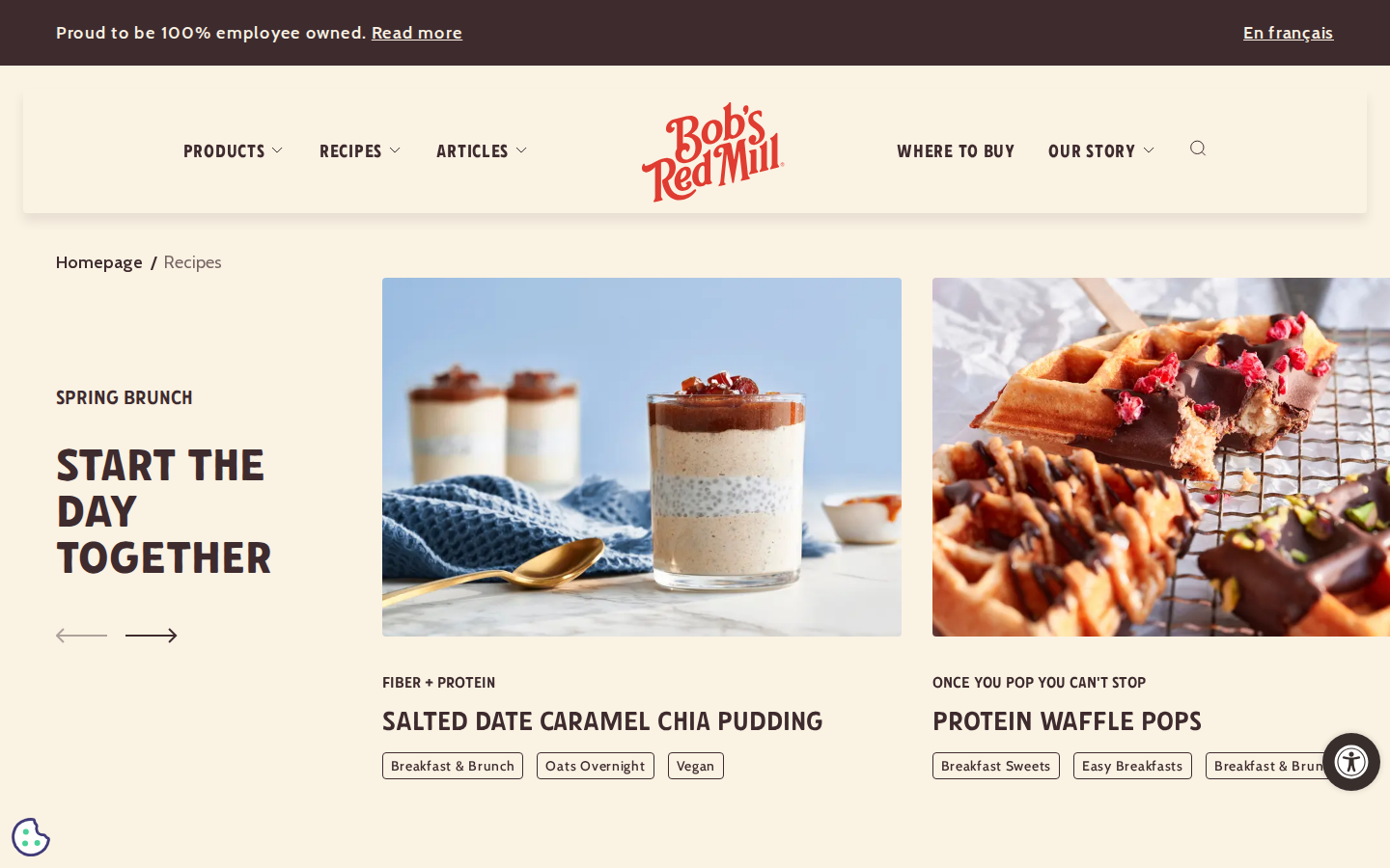
Recipe-forward navigation. This is where the repositioning from ingredient supplier to kitchen identity brand is most visible. Bob and Charlee's Recipe Box, collections by meal type, dietary filtering. The old site told you what was in the bag. The new site wants to tell you what to cook with it.
The 'Our Story' navigation link 404s. The content lives at /about-us and /founders-story. Probably a routing issue that will get fixed. But during a rebrand built on honoring the brand's history, having the story link broken is a conspicuous gap.
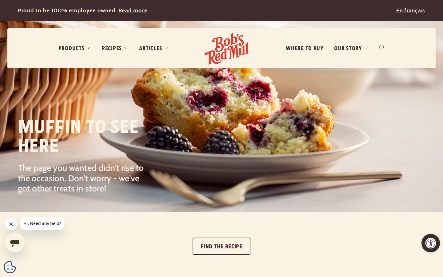
'MUFFIN TO SEE HERE.' Pun, muffin photo, recipe finder. The warmest 404 I've seen in these readings. The tone on this page is closer to the old Bob's personality than most of the redesigned pages. Unpretentious, a little corny, focused on feeding you. I think the voice that works best for this brand is the one that shows up when nobody's performing.
Analysis
Turner Duckworth made serious decisions here, and I think most of them are good. Custom typeface sourced from hand-painted farmstead signage. Mill illustration pulled from the actual building in Milwaukie, Oregon. Founder’s portrait kept on every package as a seal of quality. These choices are rooted in the brand’s own history, which is why they’ll age well.
The old packaging was dense and honest. Ingredients, origin story, dietary seals, Bob Moore’s face, all crammed onto the front of a bag. It looked different from everything else on the shelf because it was. For me, that density was functional: I could verify everything I needed without turning the bag over. The new system replaces that density with color-coded categories. They claim 50% faster product identification in focus groups. If that holds at shelf scale, it’s a real improvement. Color is faster than text, and for someone scanning multiple aisles for gluten-free products, speed matters.
But the shelf position changed. The old Bob’s stood out because nothing else looked handmade. The new Bob’s is well-designed on a shelf full of well-designed things. That’s stronger in some ways (cleaner hierarchy, faster scanning) and weaker in others (less differentiation, more maintenance to stay visible). The old bag won by being the only honest-looking thing in the aisle. The new bag has to win on design quality, and that competition doesn’t end.
The website shows a bigger move than the packaging. “Homemade Brings Us Together” as the narrative frame. Recipe-forward content. Lifestyle photography. The old Bob’s was where you bought flour. The new Bob’s wants to be part of your kitchen. That’s a repositioning from ingredient supplier to kitchen identity brand, and the site is where you can see it happening. Recipes, articles, Bob and Charlee’s Recipe Box. The brand is building a room around cooking together, not around what’s in the bag.
The thing I’m watching is the voice. Bob Moore died in 2023. His voice was specific: plain, direct, employee-first. The “Proud to be 100% employee owned” banner on every page is a structural commitment that’s harder to fake than any design choice. But the copy on the newer pages already reads warmer and more lifestyle-forward than the old Bob’s voice. That drift is natural after a founder dies. The question is whether anyone at the company is paying attention to it, and whether the design system has enough structure to hold the voice steady as the old one fades. I don’t have a clean answer on that yet. The packaging rolls out in September. I’ll know more when I pick up the new bag.