Ableton
One of the most coherent brand environments in creative tools. One page breaks it.
I’ve used Ableton since version 3. It’s where I write and produce everything. I know this software the way a carpenter knows a table saw, so reading the brand feels different from the outside reads. I’m not evaluating a stranger’s house. I’m looking at the front door of a place I’ve lived in for years.
The interesting thing is that almost everything on the site agrees with itself. The one place it doesn’t turned out to be the whole finding.
Three bars and three lines. Abstract, geometric, no wordmark. I think the mark is doing less work than almost any logo I've looked at, and I think that's intentional.
Five words: Live, Push, Move, Note, Link. Product names only. No 'Solutions,' no 'Why Ableton,' no 'For Creators.' The nav tells you immediately this company knows who it's talking to.
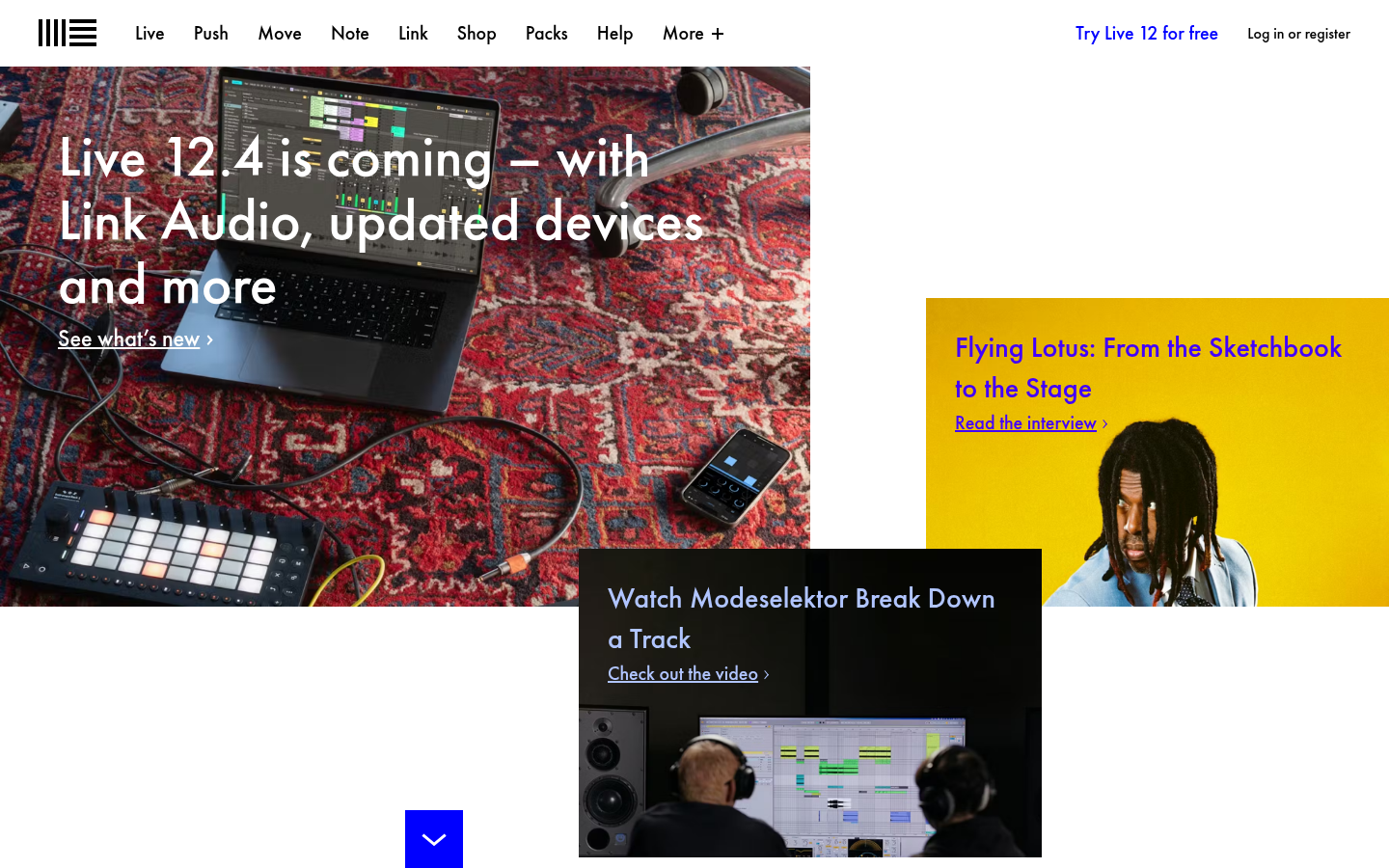
Near-monochrome. Dark backgrounds, white type, one warm brown accent. Photography provides whatever color the page needs. I keep noticing how this palette holds across every page because most brands break within three.
Clean sans-serif, uniform weight, consistent scale across all pages. The type is doing its job and nothing else. For a company whose users bend sound into shapes nobody's heard before, I keep wondering why the typography is playing it this straight.
Bathe your sound in subtle warmth. … Create wild and unpredictable sounds with just a handful of intuitive controls.
Live 12 product page
Sensory language, not technical. No feature comparison charts. No spec list. No skill-level segmentation. They're assuming you're a musician and describing what happens when you use the tool, not what the tool does.
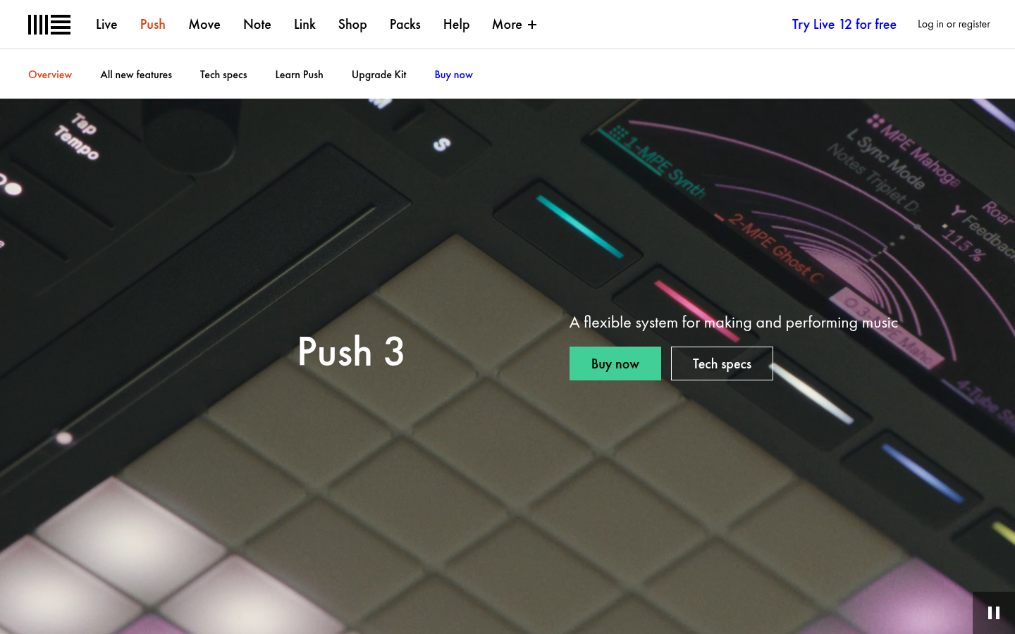
Push is six things at once and instead of picking one identity and hedging on the rest, the page gives you all six in sequence. Then six artists with completely different setups. By the time you reach the buy button you've already decided because you saw someone using it the way you would.
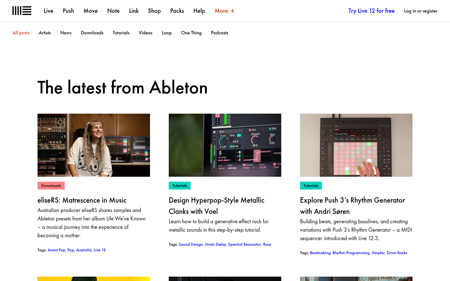
Hyperpop metallic clanks next to 'Matrescence in Music.' Same layout, same weight. Most brands rank content by commercial value. Ableton ranks by creative value.
 Blog
Blog
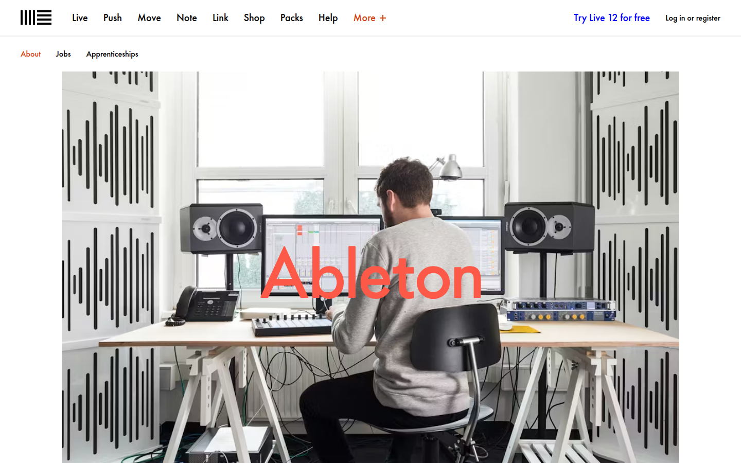 About page
I put these two pages side by side because the shift is that stark. The blog is dark, warm, studio atmosphere. The about page is bright, corporate, office photography. Same site, two completely different rooms.
We feel the same way about making Ableton products.
About page
Twenty-five years of making creative tools. The company story is one paragraph. The rest of the page is a job listing.
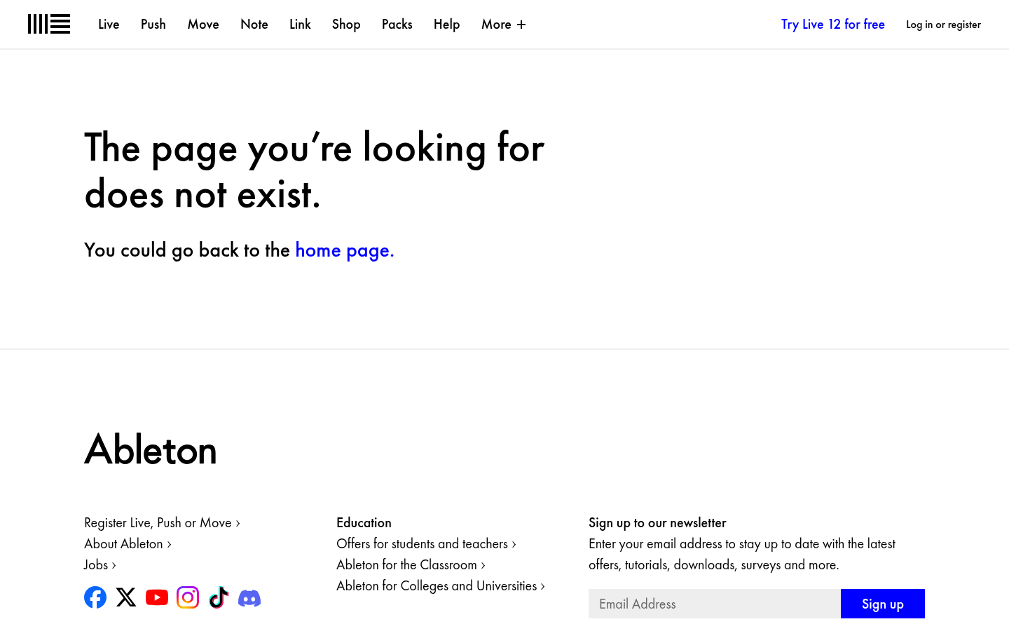
'The page you're looking for does not exist.' White background, same nav, one link home. No apology, no redirect to products, no attempt to recover the sale. I think this is the most telling page on the site because it confirms the restraint isn't a design trick on the marketing pages. Ableton sounds like Ableton even when nothing is there.
Analysis
This is voice drift, and voice drift is an accommodation failure. The blog team is attuned to artists. They know who they’re writing for, and the voice holds because of that attunement. The about page team isn’t attuned to anyone. The brand voice held across every product page, every blog post, every learning resource and then lost coherence on the one page that tells the company’s own story. The customer-facing work is tight because that’s where the creative team focuses. The corporate pages use a different register because someone else wrote them and nobody checked whether they sounded like the same company.
I think about what this means as brands start scaling content production with AI tools. A page that’s already off-register becomes the template. Voice drift accelerates. The structural coherence that Ableton maintains so well across its product pages and blog is exactly what gets flattened first when there’s no structural system holding it together. The about page is a preview of what the whole site could sound like if nobody’s paying attention to where the voice is drifting.
Ableton tells better stories about the people who use its products than about the people who make them. The blog gives every artist a full profile with methodology and history. The about page puts twenty-five years of making creative tools into one paragraph.