MathOnTape
Visual-Sonic Brand Integration
MathOnTape is dirty analog synths, magnetic tape, feedback loops. No commercial goal. It’s experimentation with correlating visual aesthetic with audio aesthetic in the brand systems arena, the same way Aiden Jae integrates photography direction with platform architecture, except here both surfaces are mine.
Most electronic music is composed by intuition, layering sounds until something feels right. Most album art is made after the music is finished. Two separate processes. The cover never quite fits because it was built for a finished thing, not alongside it. This project does neither of those things.
The design system doesn’t illustrate the music. It correlates directly with it. Every visual element is the visual equivalent of a sonic property:
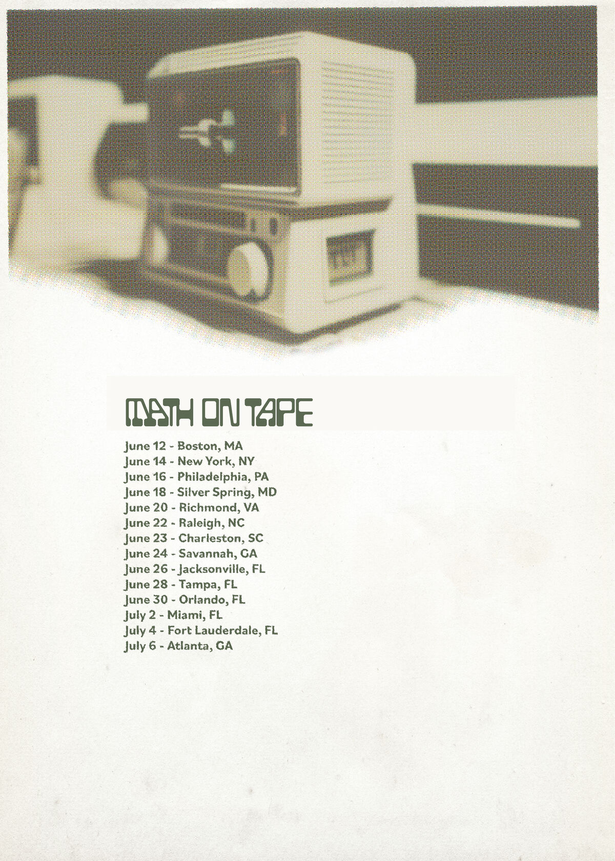
- Tape hiss → halftone dot patterns. Visual grain that behaves like audio grain.
- Audio distortion → print misregistration. The visual artifact of misalignment mirrors the sonic artifact of overdrive.
- Magnetic tape → MICR typography. The typeface from the bottom of bank checks, a bureaucratic encoding system applied to personal experimental music. The tension between institutional form and obsessive content is the identity.
Releases are named like archival documents: series codes, catalog numbers, album art treated as field manuals. The project presents itself as institutional documentation of a personal obsession.
Pull the visual system away from the sonic system and both break. That’s integration: not two things made to look alike, but two surfaces of the same governing logic.