Visual Studies
Constraint-Based Graphic Explorations
Updated March 2026
I sat down one day and brain-dumped every topic I wanted to make something about. Kaijus. Cryptids. Stoicism. Song lyrics. Red light districts. Uncommon words from other languages. Cars that earned their names. I wanted to see what they looked like when I ran them through design constraints instead of just illustrating them. Not fan art. Not decoration. The goal was for the work to add something to each topic, not just display it.
The list became a set of series. Each one locks a constraint: a grid system, a format, a typographic rule, an aspect ratio tied to a specific camera. Then it gets populated with subject matter the constraint was never designed for. What survives is the finding. When something develops enough weight, it graduates into its own project.
This is the sketchbook. No client, no deadline. Still an art school kid playing with his design education.
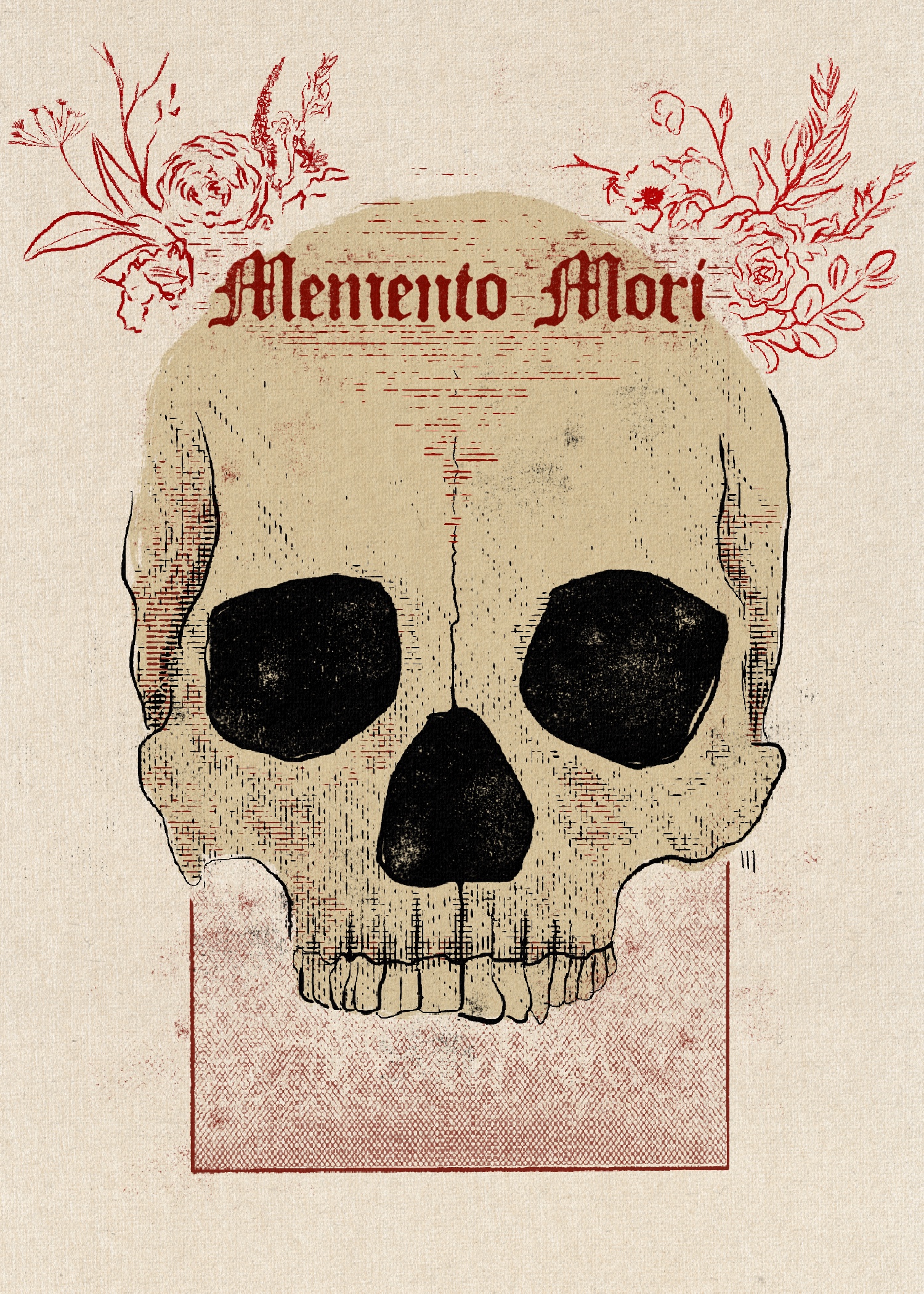
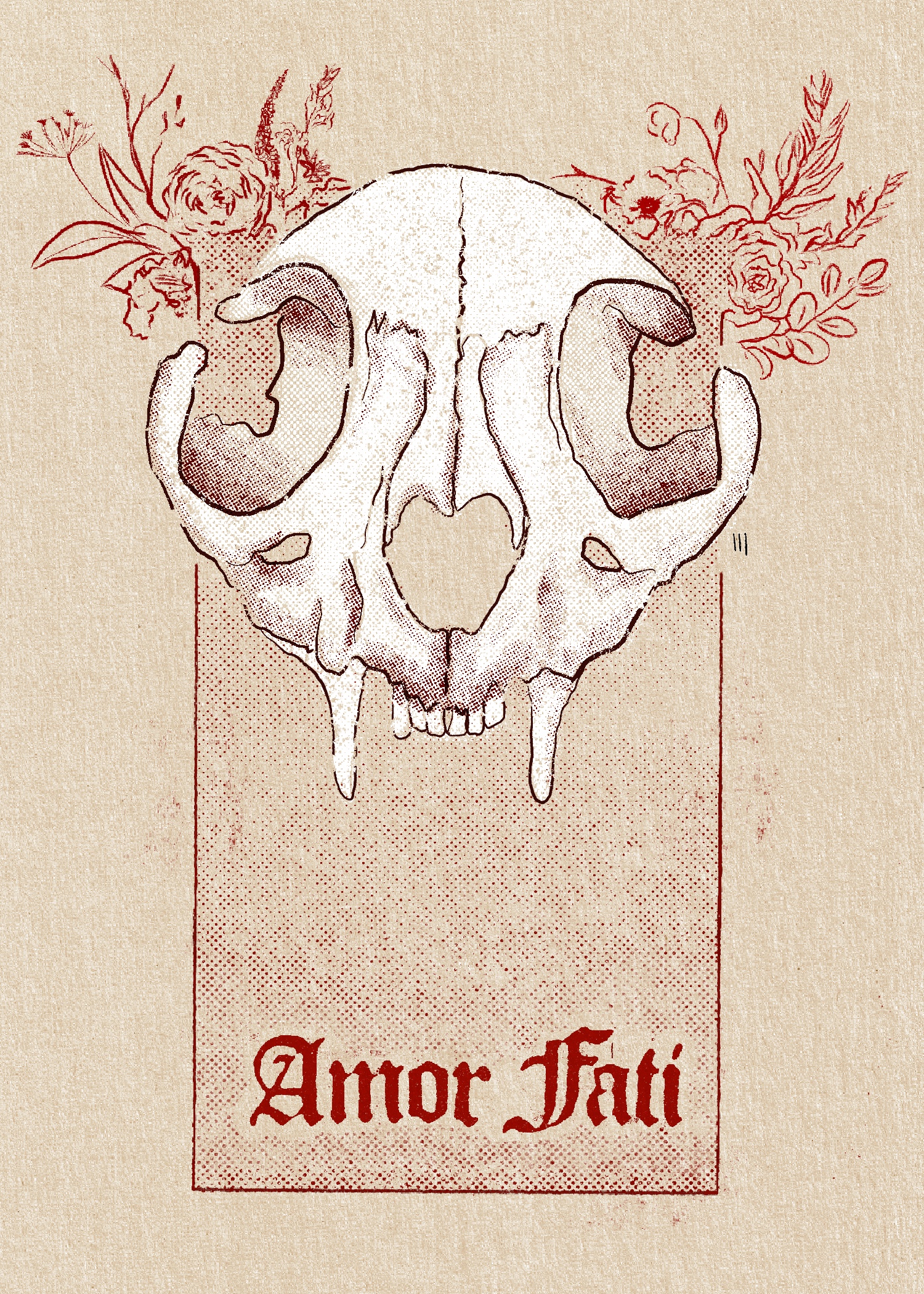
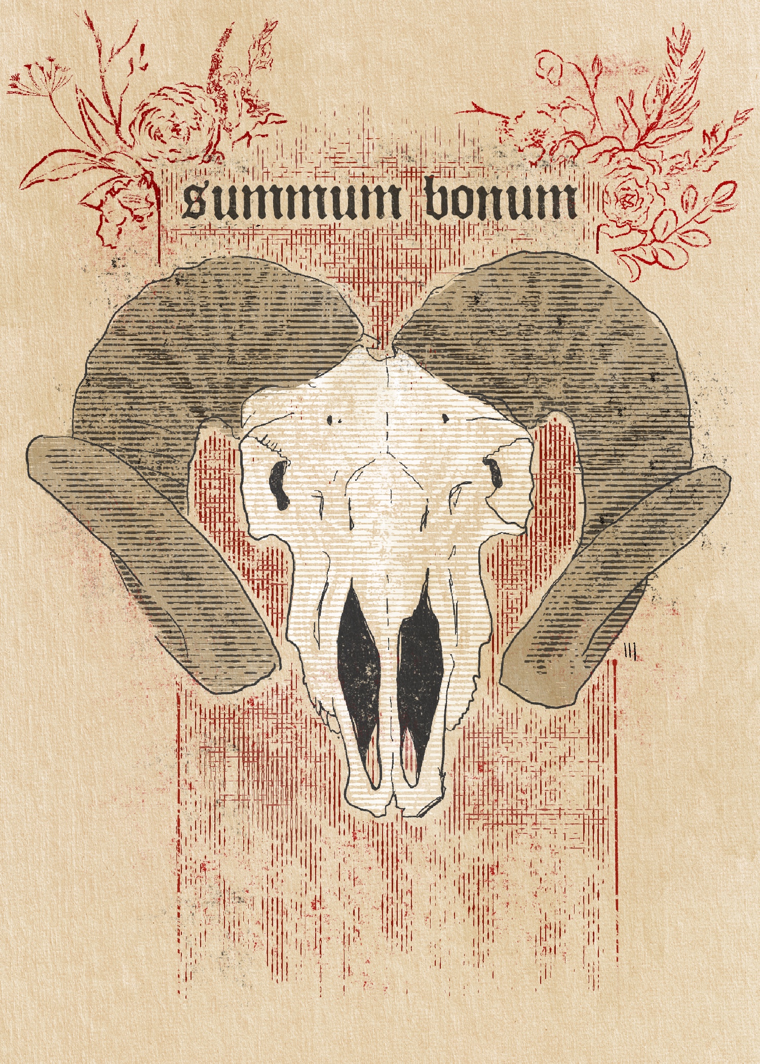
Echo & Bone
The same patterns kept showing up across unrelated work. The same archetypes holding a brand identity together, a narrative, a household. I wanted to document them as structural engineering, not decoration.
Stoicism is the first test case. Three prints, each pairing one Stoic concept with skull iconography. Illustrated in Procreate with halftone brushes to look aged. The constraint: the visual element encodes the same content as the text, at the level of symbol, not illustration. Type and symbol form one diagram.
Photogeography
My father was into photography. A neighbor gave me an SLR (the Minolta) when I was a kid, and I ended up in a photo class at Kingsborough. From there it became the visual component of everything: travel, relocation, documentation. Decades of narrative image.
This isn’t really about the 35mm. It’s about the travels and the things I noticed in them. When I look back at the photos now, they read as a roadmap of a life, not a portfolio. These places existed. I was in them. Something caught my eye.
Photogeography is a formal system for that archive. Three locked aspect ratios, each encoding the relational mode of the encounter: 3:2 landscape from the Minolta (deliberate, committed), 4:3 from the phone (ambient, incidental), 1:1 square (stillness, compression). No cropping, no post-processing. Mandatory metadata: GPS coordinates, timestamp, camera and film. The archive is verifiable, not curated.
If you can’t crop, you reposition. If you can’t change the ratio, you learn to see in the shape the format demands. Fewer options means you actually have to see what’s in front of you.
Versagrams
Most song posters illustrate what a song is “about.” The image references the mood. The lyrics get set in whatever type looks good. Neither element comes from the same source, so they coexist without cohering.
I wanted to see what happens when the lyrics are the actual generative input. The text itself, fed into AI image generation within the typographic parameters the grid establishes. What comes back is specific to that song, because the input is the actual words, not an interpretation of them.
Fixed format across every piece. Polaroid-style vertical (SX-70). Song title at the top. AI-generated image. Song lyrics. Song metadata, including QR code. Swiss grid, rhythm, and proportion establish the framework. The system doesn’t change per piece. The content is what makes each one distinct.
First batch: 16 songs. Among them: “Soft Serve” (Soul Coughing), “2 Wicky” (Hooverphonic), “Limit to Your Love” (James Blake), “Cherub Rock” (Smashing Pumpkins), “46 & 2” (Tool), “Beware” (Deftones), “Sour Times” (Portishead).
In development.
This is how I work. If it sounds like what you need, let's talk.