Aiden Jae
Building a Brand from Raw Material to Running Business
Updated February 2026
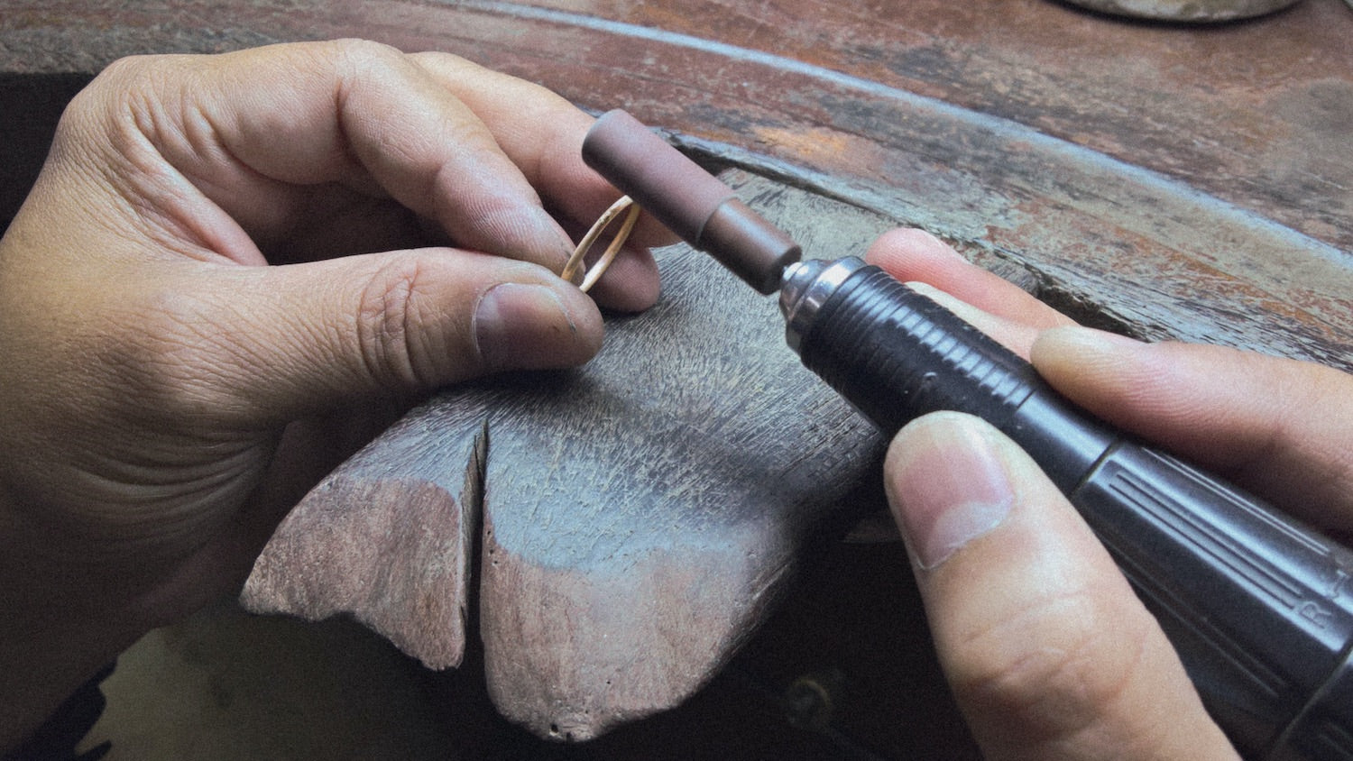
The founder is a merchandiser, not a maker. Her advantage is a decades-long relationship with Beauty Gems, a premier jewelry manufacturer in Bangkok. The pieces are manufactured and hand-detailed: cast, stone-set under microscopes, hand-finished and polished by artisans who’ve been doing this work for decades.
She knows exactly what separates this from mass-market jewelry. She had no way to make a stranger see it through a screen. That’s the job: take what a founder knows about their product and build a system that communicates it to someone buying through a screen.
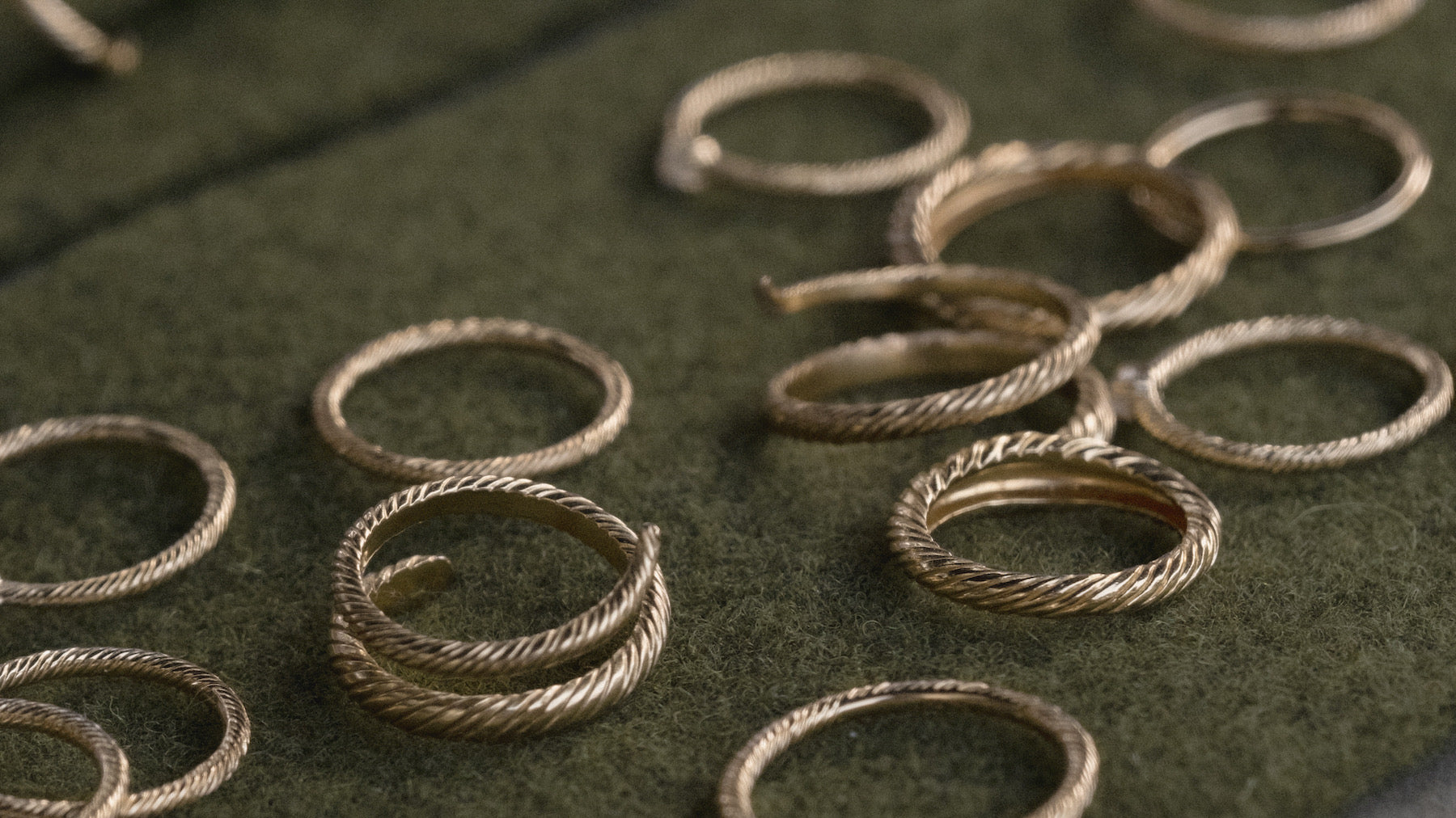
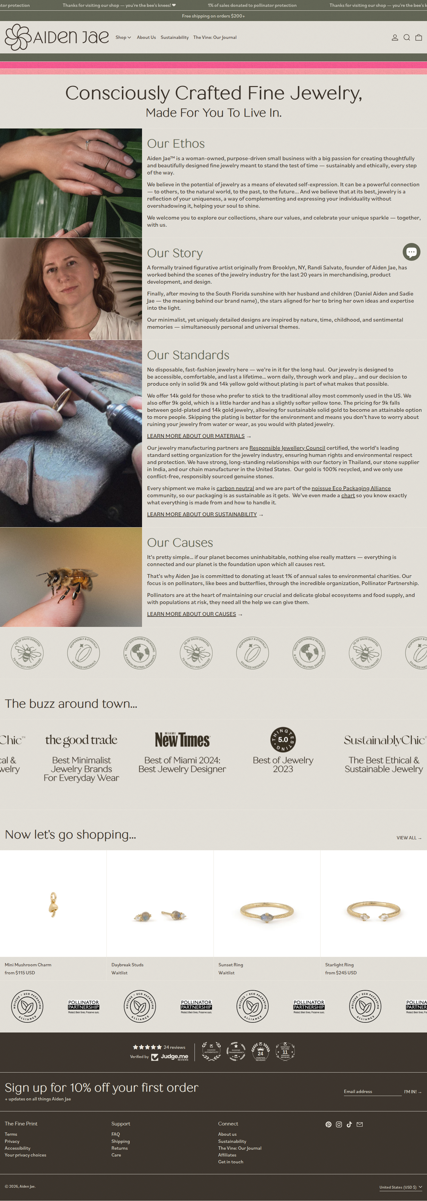
The founder had three things most jewelry brands don’t: genuine quality (manufactured and hand-detailed from recycled gold at a factory she’s worked with for years, not mass-produced to a price point), an honest price story (9k gold positioned for a specific customer in a struggling economy, bridging fast fashion and traditional luxury), and a mission that’s operational rather than decorative (a portion of every sale funds pollinator protection, sustainable packaging, how the business actually runs).
None of it was legible. The quality existed in the product, the price story in the founder’s head, the mission in operations. A customer landing on the Shopify template saw none of it, just a thumbnail the same size as a $15 drop-shipped ring.
The work was good. The screen didn’t show it.
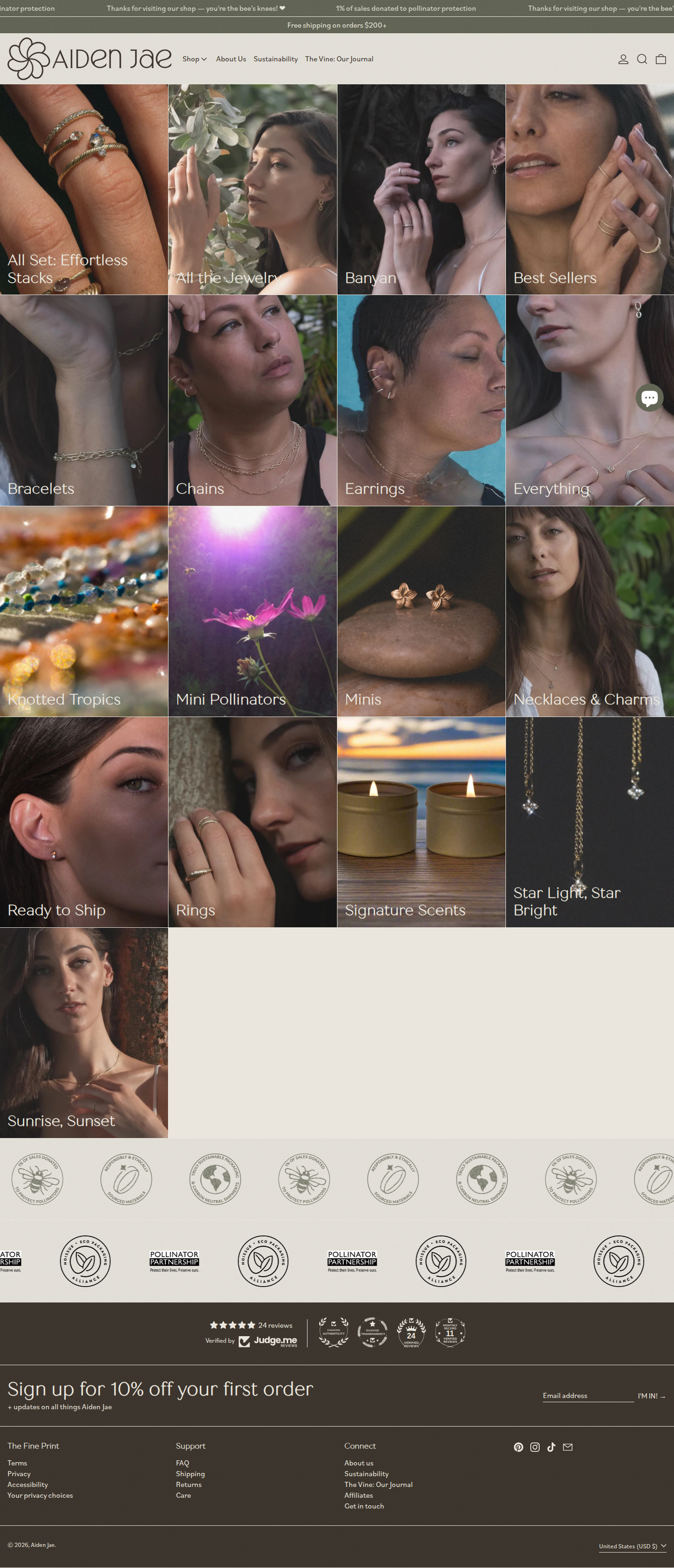
The entire brand identity built from scratch: logo, typography, color palette, photography direction, packaging system, and platform architecture. Each decision serves one principle: clarity over aspiration.
The Wordmark and Visual Language
The identity needed to feel restrained and elegant without performing luxury. Clean typographic wordmark. Organic-influenced palette drawn from the materials themselves: stone, clay, brass, tropical green. Generous whitespace. Typography that prioritizes readability over decoration.
These weren’t aesthetic preferences. They were rules, and the brand enforced them. If the brand claims “accessible luxury through transparency,” then every visual element must reinforce that claim. Ornate effects undermine it. Busy color contradicts it. The visual system is a constraint that rejects inauthenticity. Try to write “elegantly crafted with love” and the design language exposes it as hollow.
Photography Direction
This is where the brand either proves itself or lies. I established a photography pipeline with specific constraints:
- Lighting that reveals material properties: the way gold catches light, the texture of a stone, the quality of a setting
- Angle conventions: top-down primary, angled secondary, detail tertiary
- Post-processing that reveals rather than hides. No retouching that removes evidence of hand-finishing. No color grading that promises a finish the piece doesn’t have.
- Aspect ratios that vary because each piece’s visual weight dictates its frame (the system doesn’t force the photograph into a preset box)
The photography doesn’t illustrate the brand. It is the brand. When a customer sees the actual texture of recycled gold under honest light, they’re seeing the cost structure, the sourcing story, and the production standard without reading a word.

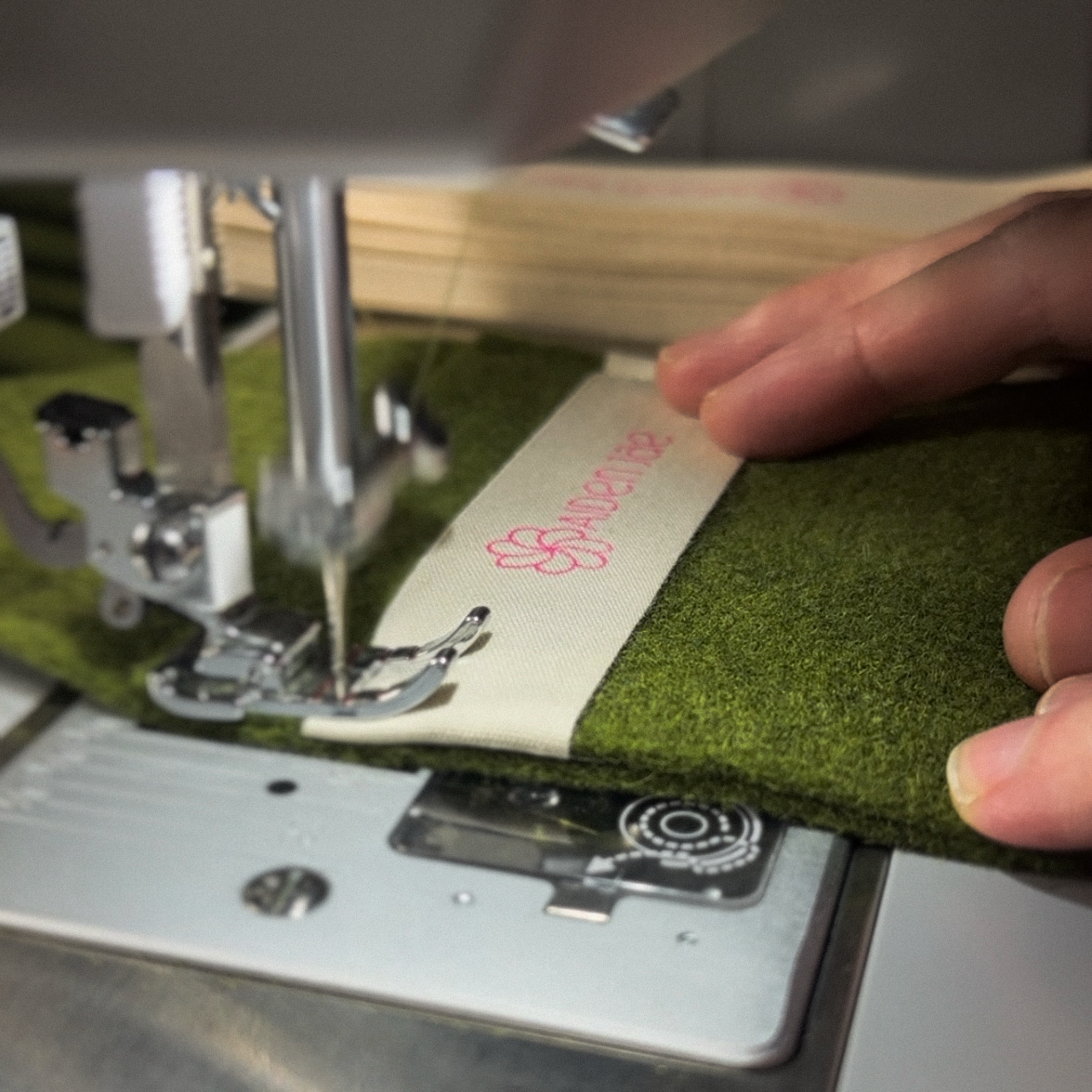
Packaging and Touchpoints
I designed the packaging concepts. Custom wool felt pouches sewn in-house. Sustainability isn’t a badge on the website. It’s the material the customer touches when the package arrives. The packaging reinforces the story the photography started and the platform continues.

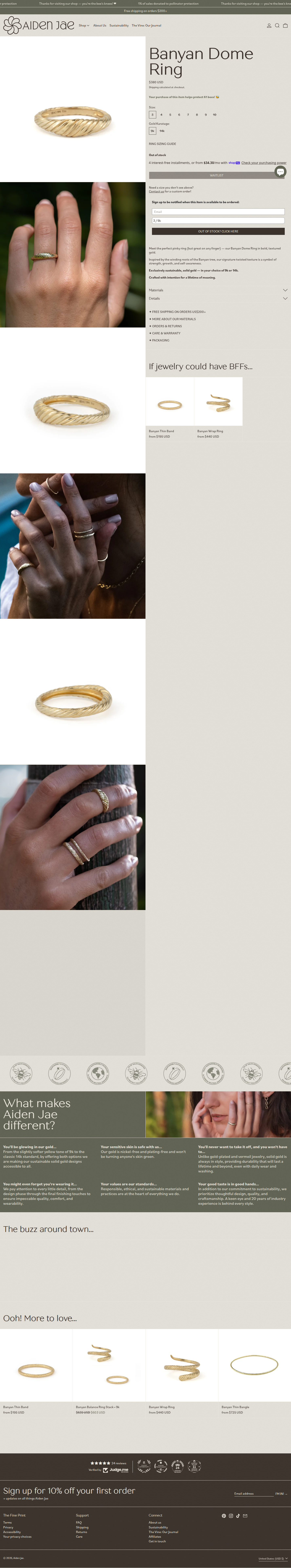
The identity existed. Now it needed a medium that wouldn’t contradict it. A Shopify template treats every product identically: same grid, same hierarchy, same assumptions. A quality ring in a generic grid says “this is one commodity among many.” The platform had to do the opposite.
The Architecture
I built a custom Shopify system (Liquid templates, SCSS framework, product page architecture) designed around one idea: the code respects the photograph instead of overriding it.
Standard e-commerce templates are static containers. This system is responsive to content: if a photograph is visually dense, the template adds breathing room. If it’s light, spacing compresses. Typography scales proportionally to the photograph’s dominance. The code calculates layout based on what the image actually needs, not what a template assumes.
Product pages are structured as micro-case-studies: material story, production notes, design rationale alongside the piece. The platform makes thinking visible. It doesn’t hide process behind marketing copy. It shows the work.
The Collection System
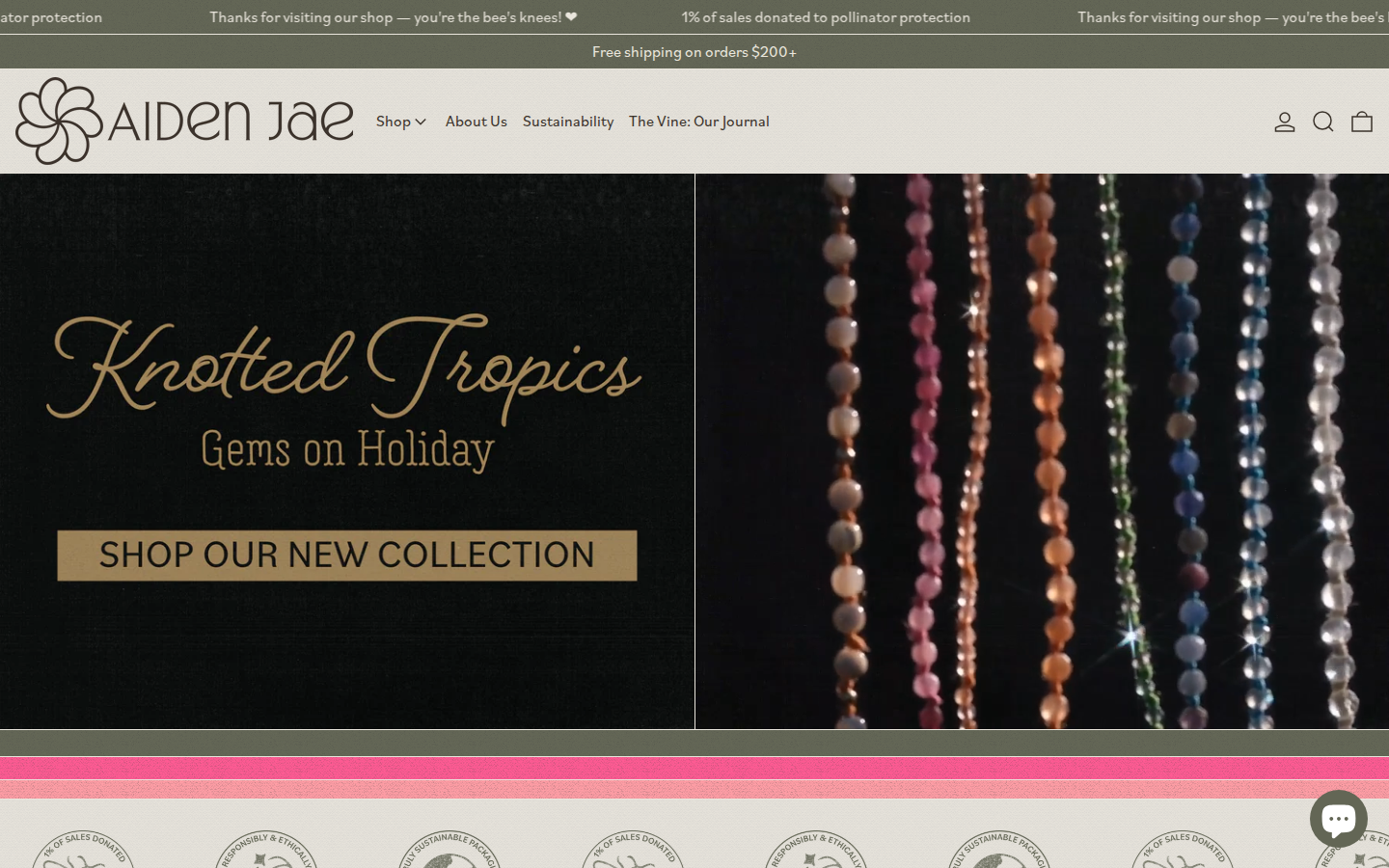
Collections aren’t just product categories. Each collection carries its own visual identity within the brand system: Banyan (the signature textured gold), Knotted Tropics (gemstone and hemp), Sunrise/Sunset, Star Light. The grid adapts. The system holds coherence across different materials and moods without losing the underlying brand logic.
The Full Experience
From announcement bar to footer, the site operates as one integrated system. Navigation, sustainability messaging, collection browsing, product detail: every interaction reinforces the same principle: this brand shows you its work instead of performing for you.
The platform scales. New product lines with different materials and different photography requirements still hold the brand logic because the system is principle-based, not template-based. The visual system communicates without copy. The way products are photographed, spaced, and presented does the storytelling before the About page loads.
What any generic template can’t produce is the governing logic that connects each piece to the others. Copy the photography without the identity system and the images look good but don’t add up to anything. Copy the identity without the platform and the design contradicts itself on every product page.


This wasn’t a website project. It was a business’s entire communicative infrastructure: identity, photography, platform, packaging, market positioning, built as one interdependent system.
Remove the photography direction and the templates have nothing to respect. Remove the templates and the photography lives in a generic grid that contradicts it. Remove the brand identity and both lose their governing logic.

Behind the system is a judgment call about what this particular founder’s brand actually is and what a stranger needs to see. MathOnTape operates on the same principle. Pull the visual system away from the sonic system and the whole thing breaks.
This is how I work. If it sounds like what you need, let's talk.