Altrueism
Transparency as Visual Architecture
The first round of explorations went where most craft brands go: script fonts, cursive motion, gesture. The visual language of handmade warmth. It looked right. It matched the category. It was the wrong answer.
The client made handcrafted objects with sustainable ethics. Their world was communal craft, care, rhythm, slow making. The script fonts performed an emotion the client did not actually have. Warmth as a category signal, not warmth as the truth of the work.
Script fonts say “handmade.” They do not prove it. The brand needed to reflect the actual character of the work, not play a version of it for the audience.
That same discovery informed Aiden-Jae, another craft brand where the generic visual vocabulary would have flattened the real character of the work. The diagnostic question is always the same: what does the brand need to prove, and is the visual system proving it?
The breakthrough: the visual system needed to make the client’s actual working style visible. Not through messaging. Through marks. Evidence of human choice rather than algorithmic smoothing.
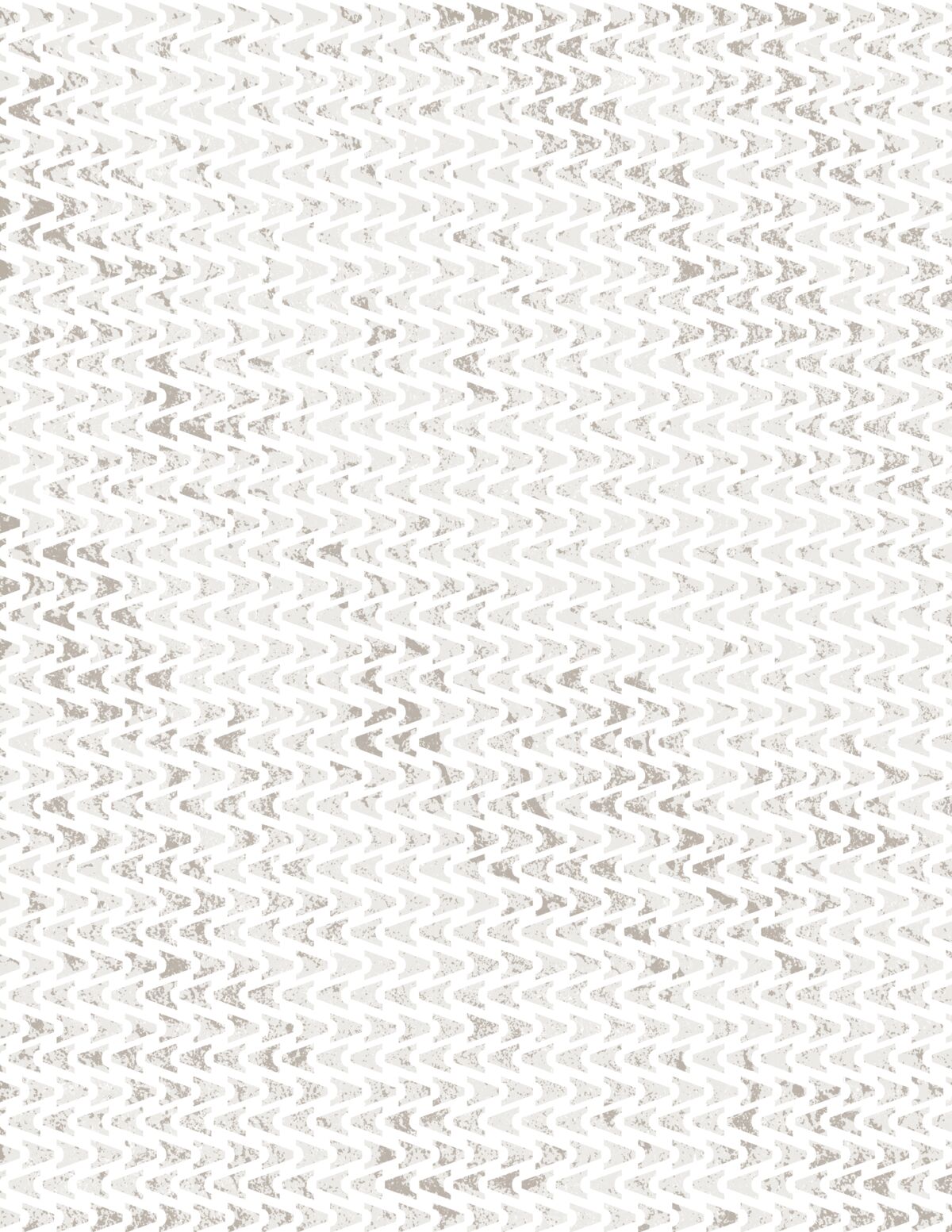
Hand-made mark system. Hand-drawn marks, scanned originals, intentional irregularity, weathered stone textures. The roughness says: we don’t hide behind polish. We show our work.
Typography architecture. Rigorous hierarchy, constrained palette, performance-first legibility. Each spacing decision reflects importance, not aesthetic preference. Consistency proves discipline.
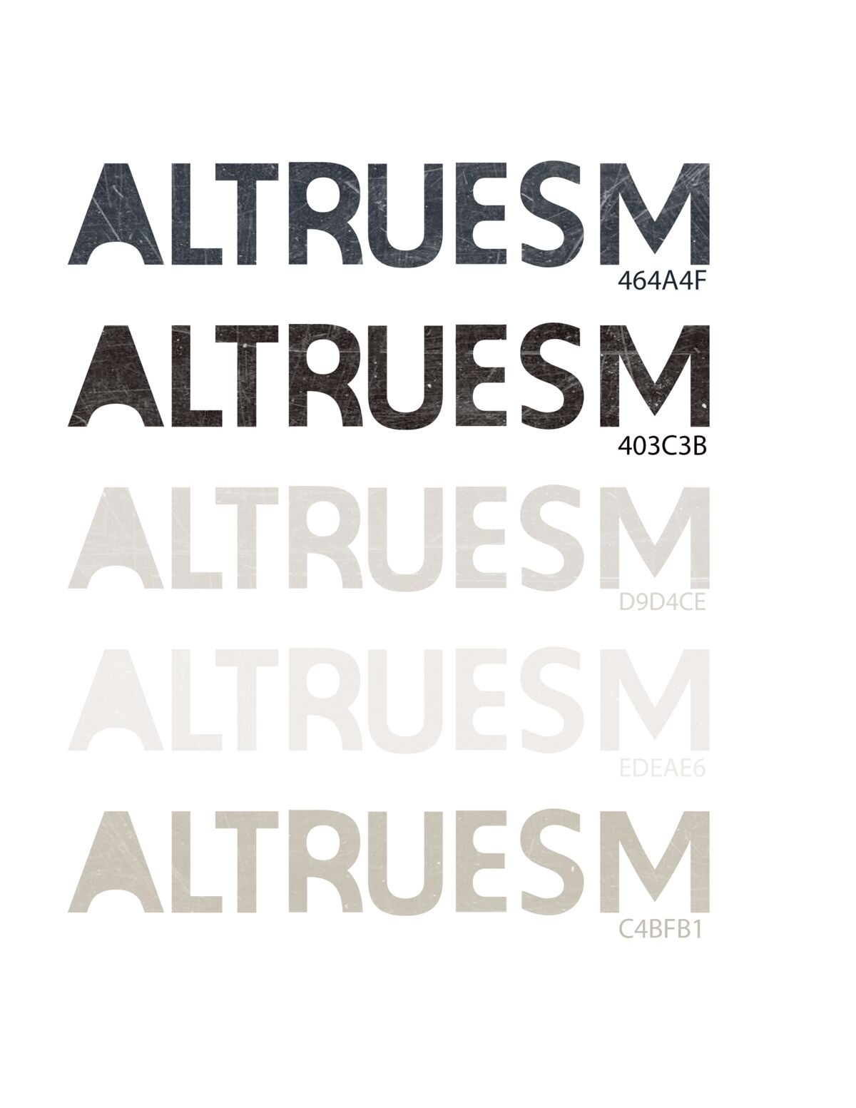
Color system. Operational, not decorative. Each color serves function, not mood. Limited palette. Accessible by design (transparency includes access).
Each visual element had to be load-bearing. No decorative choices allowed. Imperfection required explanation: why this level of irregularity, and what does it prove?
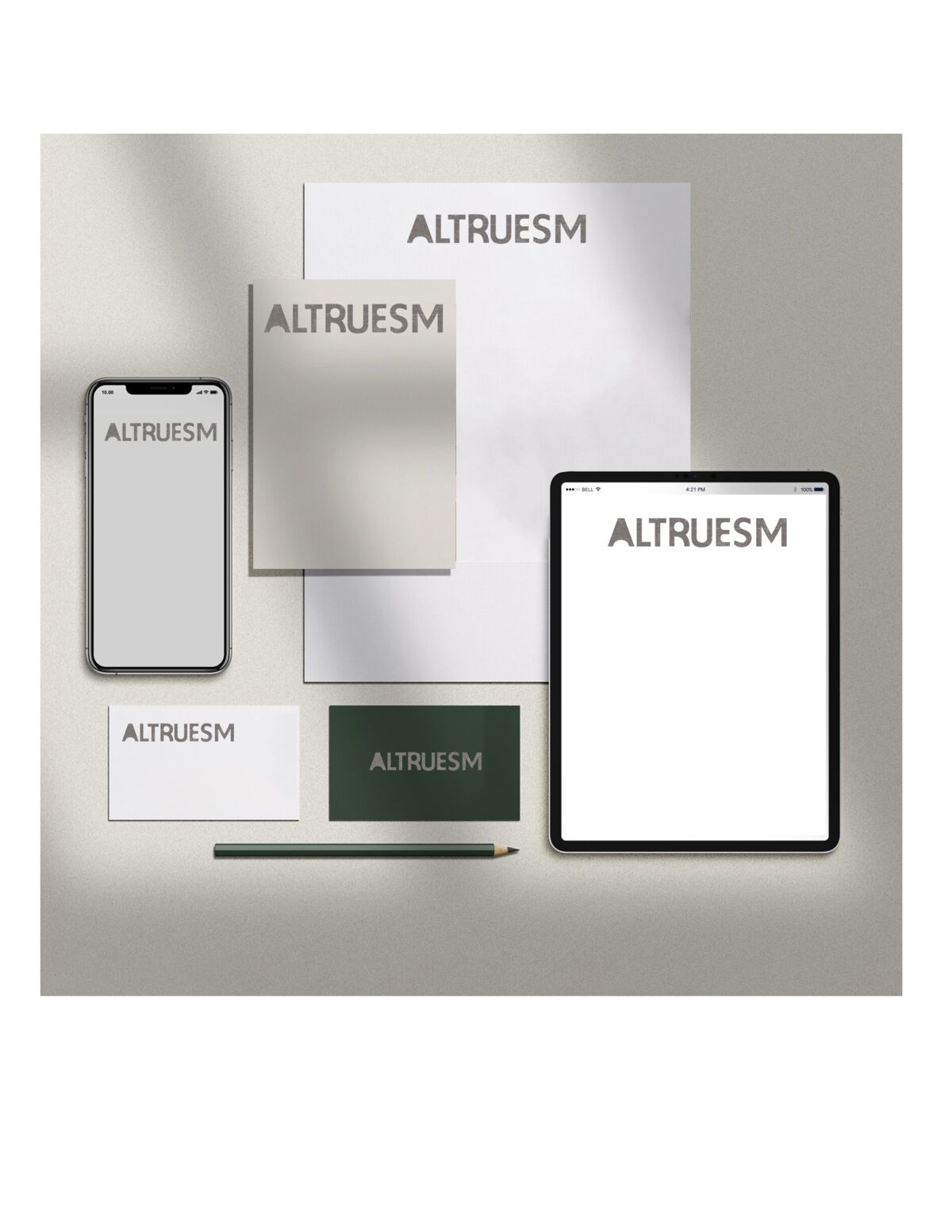
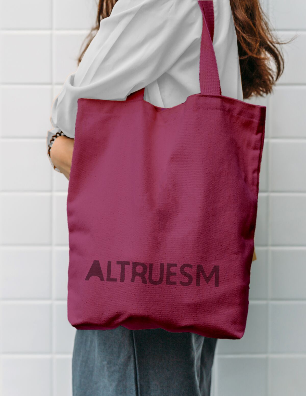
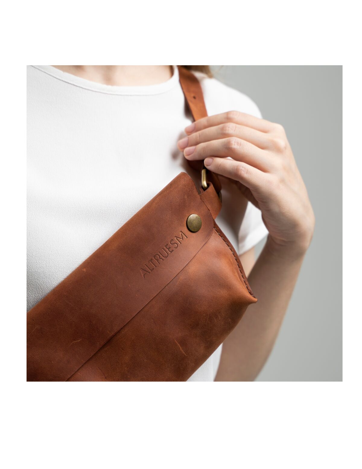
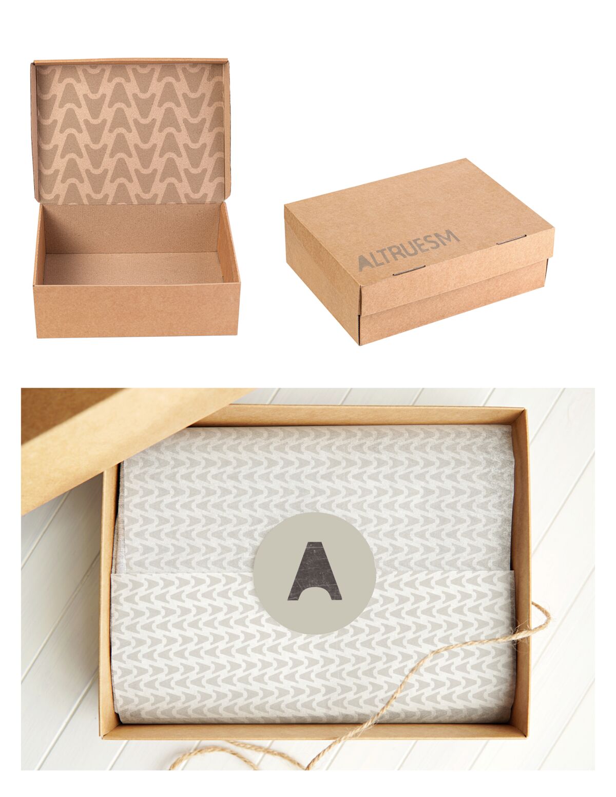
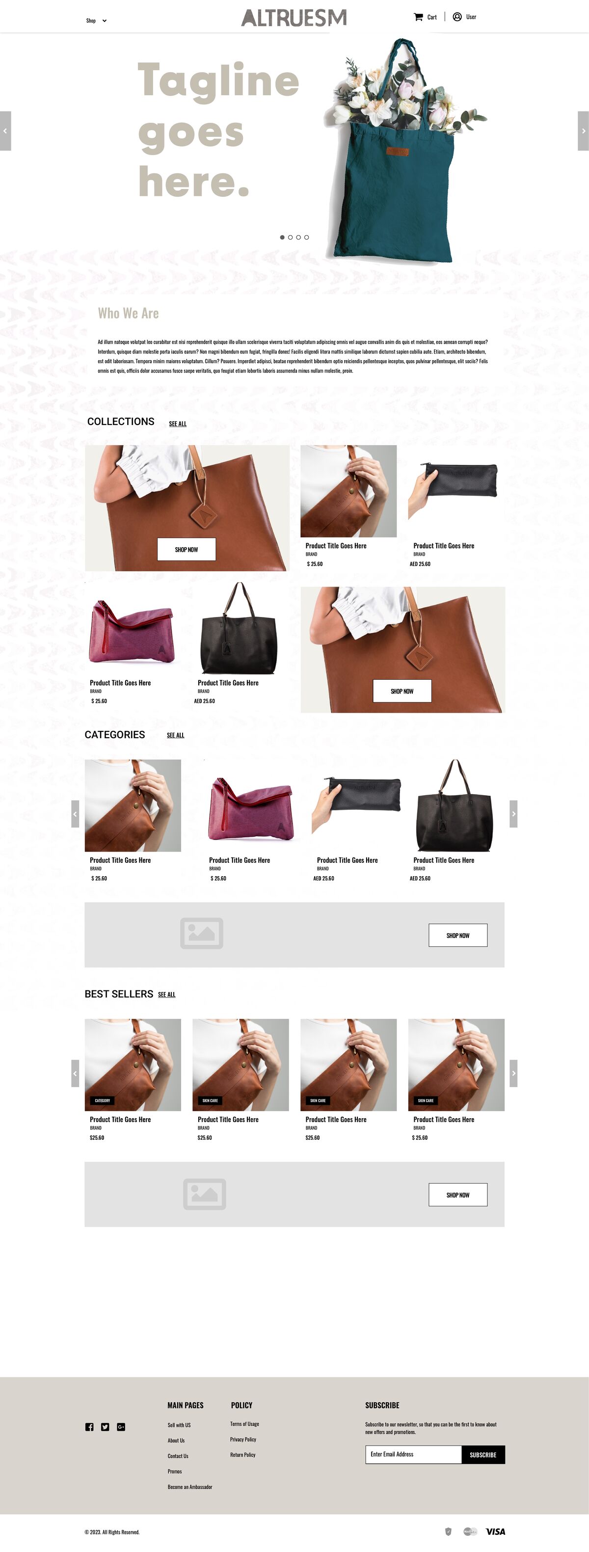
Full identity, visual language, packaging, brand book. Restrained wordmark, earthen palette, humanist typography with intentional breathing room, print materials on recycled stock with visible fiber. A brand book written as a meditative tool for intention rather than a marketing document. Every element justified by function, not mood.
Delivered as one integrated system. What happens after handoff is the client’s. The work was finished when it left.